Small brands do not have small problems.
Many of the smaller projects I take on matter to me for the same reason the bigger ones do: opportunity and challenge. Like any brand, they need a clear idea, a point of view, and enough care in the execution that people can feel the difference. Smaller brands usually do not come with large teams, large budgets, or anyone waiting nearby to lovingly maintain the brand system after you hand it over.
That makes the design challenge more interesting, not less. The work has to be strategically sound, visually distinctive, and practical enough to survive in the real world. A good identity for a small brand should not require constant supervision or a 90-page manual no one will ever read. It should give people something they understand, believe in, and can actually use when I am not around.
Below is a small sample of this type of work.
batch®
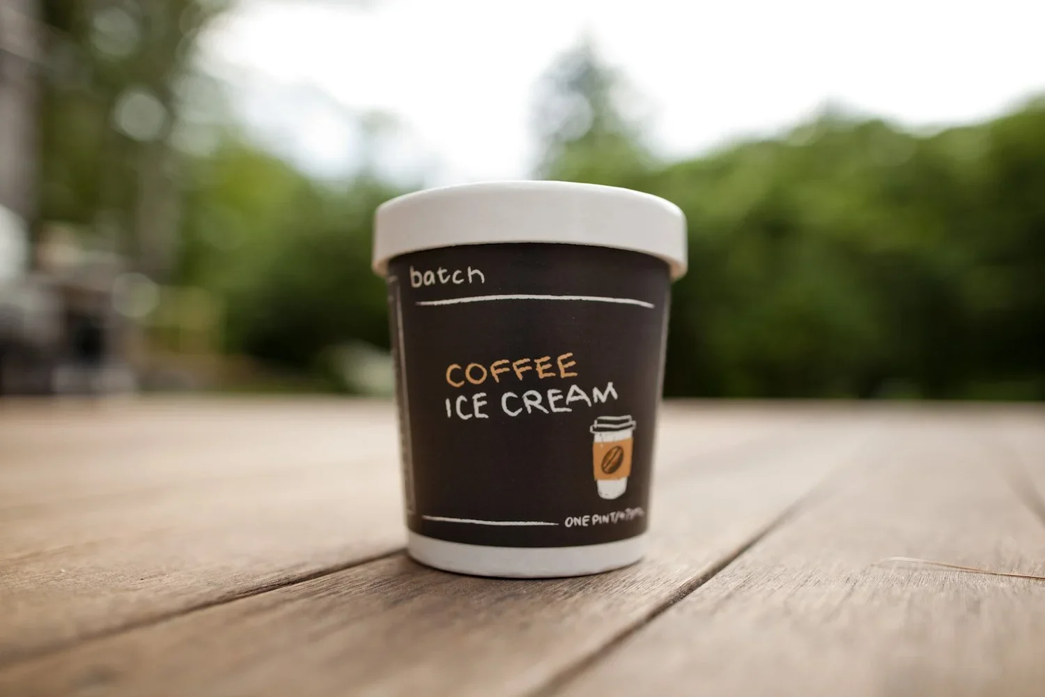
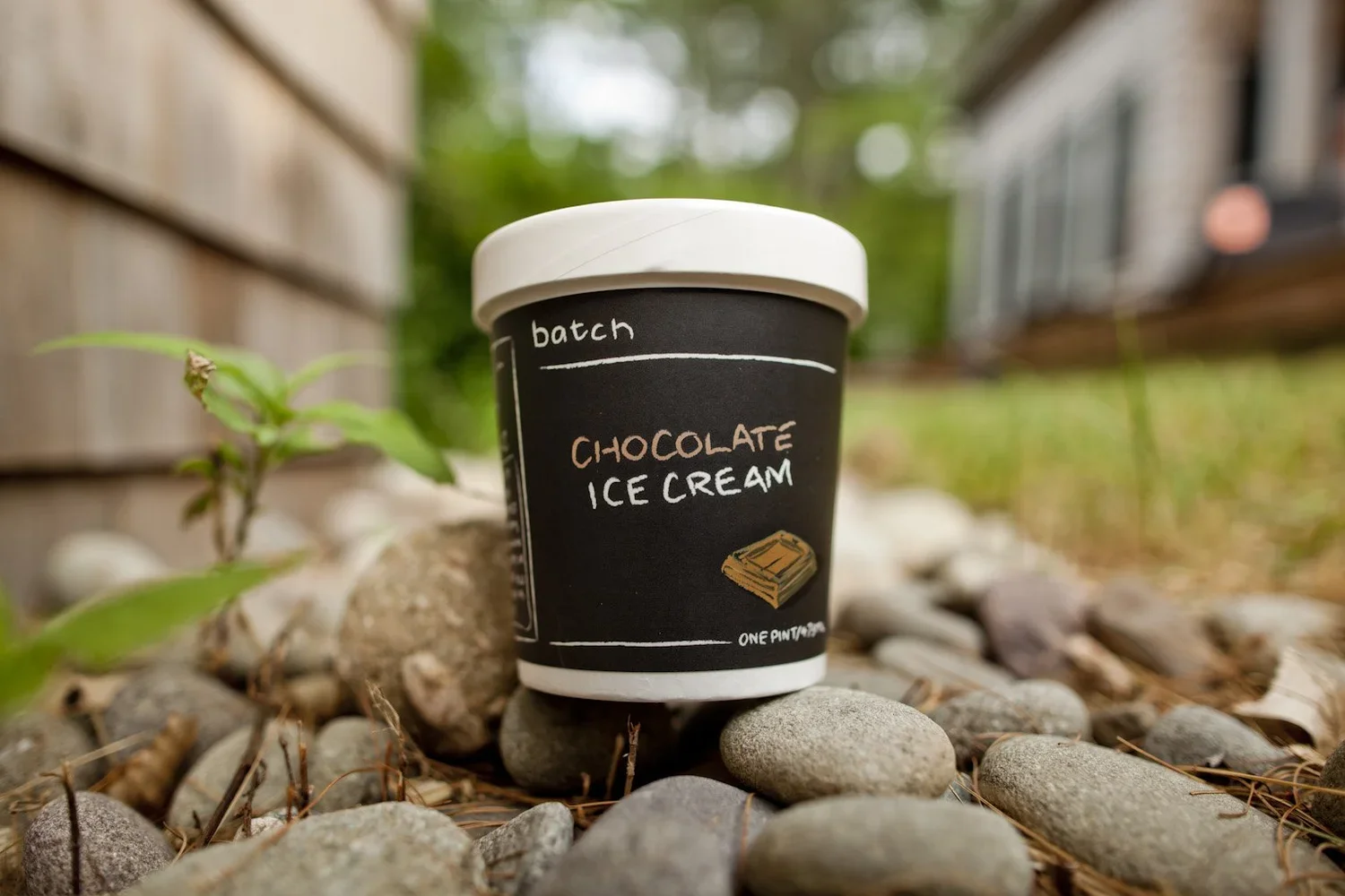
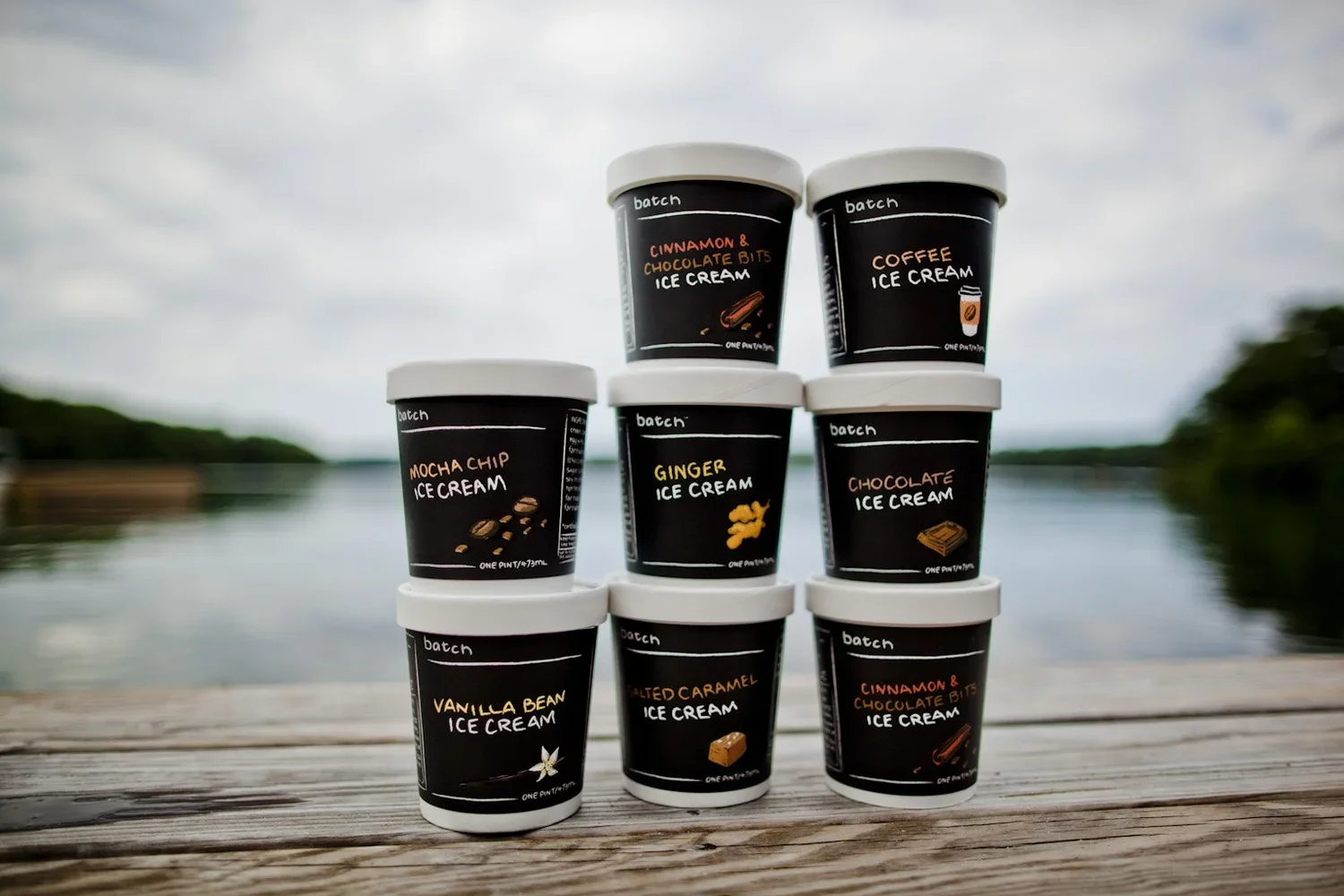
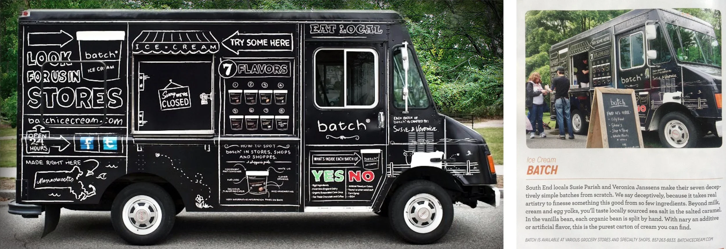
Batch was built around a simple belief: the more local the ingredients, the fresher the ice cream. And the fresher the ice cream, the less you need to mess with it.
The name came from the way Susie and Veronica made the product. Each flavor was just that — a batch. Made by hand, in small quantities, with whatever was fresh, available, and worth turning into ice cream before it was gone.
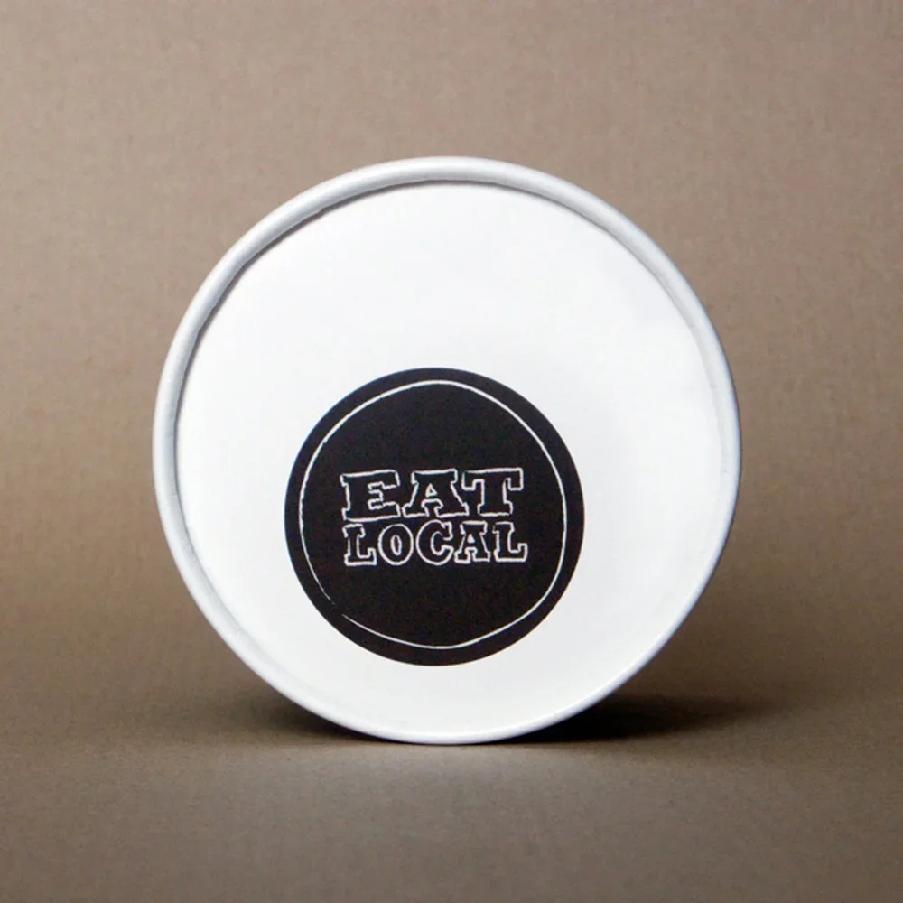
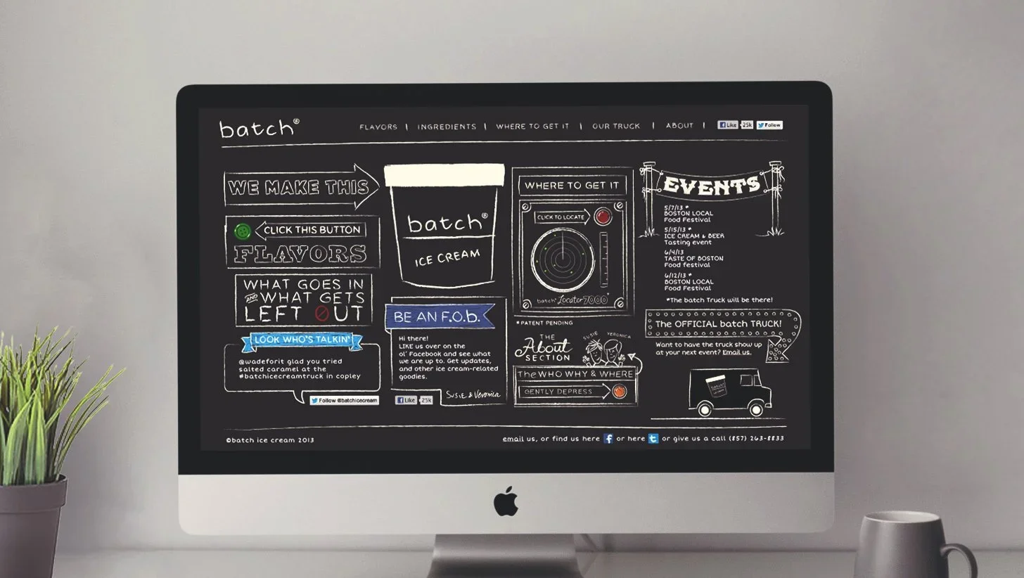
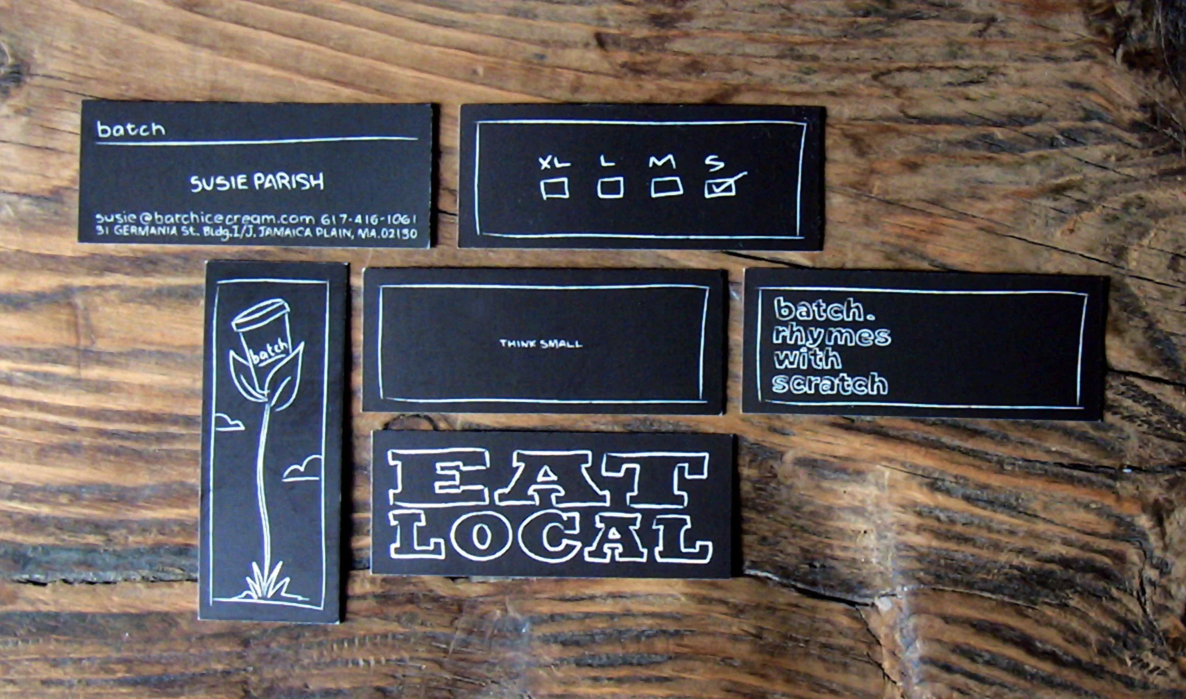
So the identity had to feel the same way. We knew a logo would matter, but we also knew the brand could not afford to act like a big packaged-goods company. The packaging had to do most of the marketing. That led us to the chalkboard — the universal language of local restaurants, daily specials, farmers markets, and “get it before we run out.” It gave us a device that felt fresh, flexible, and repeatable across anything we could put the name and philosophy on.
From there, “made by hand” became the rule. I drew everything whenever possible and hand-rendered all of the typography. If you’ve ever hand-drawn the type on a nutrition label, you know the particular little nightmare I created for myself. But while that part may have been a nightmare, founders Susie and Veronica, along with their little brand, were a dream client.
Small hurdles.
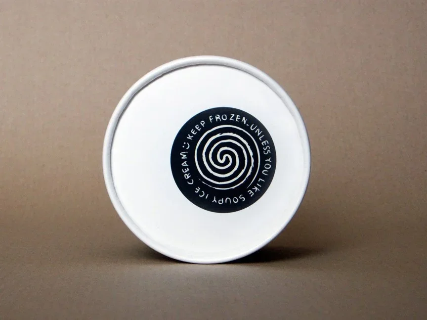
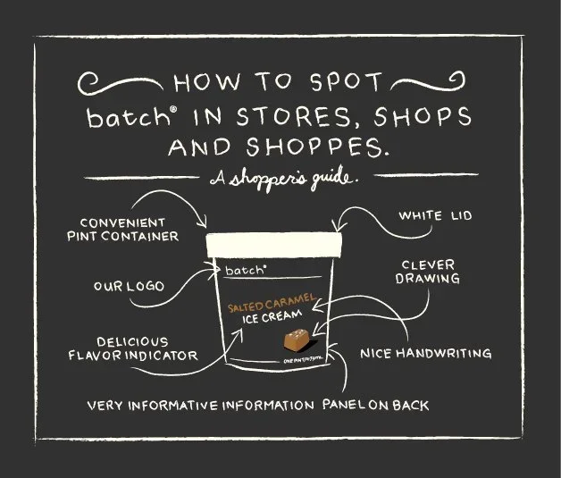
Working with a new brand always presents interesting challenges. In Batch’s case, one of them came from the packaging itself.
After choosing their containers — pre-made to-go soup cups with lids — the owners realized the small steam hole in the lid was causing the ice cream underneath to dry out and crystallize. They called and said they might have to rethink the packaging.
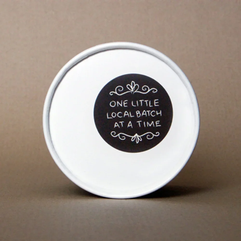
Instead, we treated it as one more chance to add a special detail. Literally cover the problem. We developed a series of stickers that sealed the hole, protected the product, and gave the brand another small moment of charm. Better still, they helped Batch stand out in the freezers of the local retail shops where the ice cream was first sold.
Not every brand problem requires a massive rethink. Sometimes it just needs the right sticker.

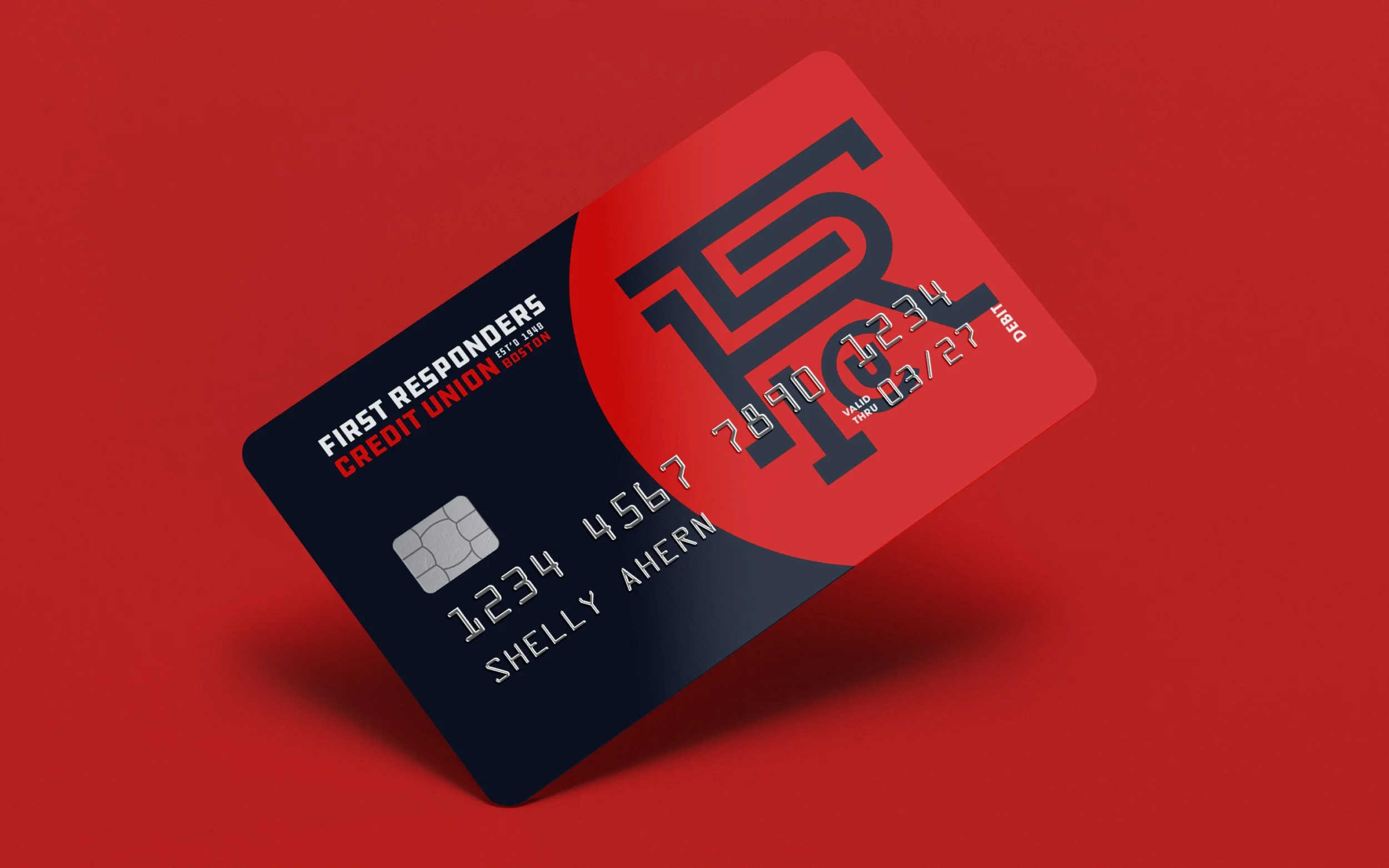
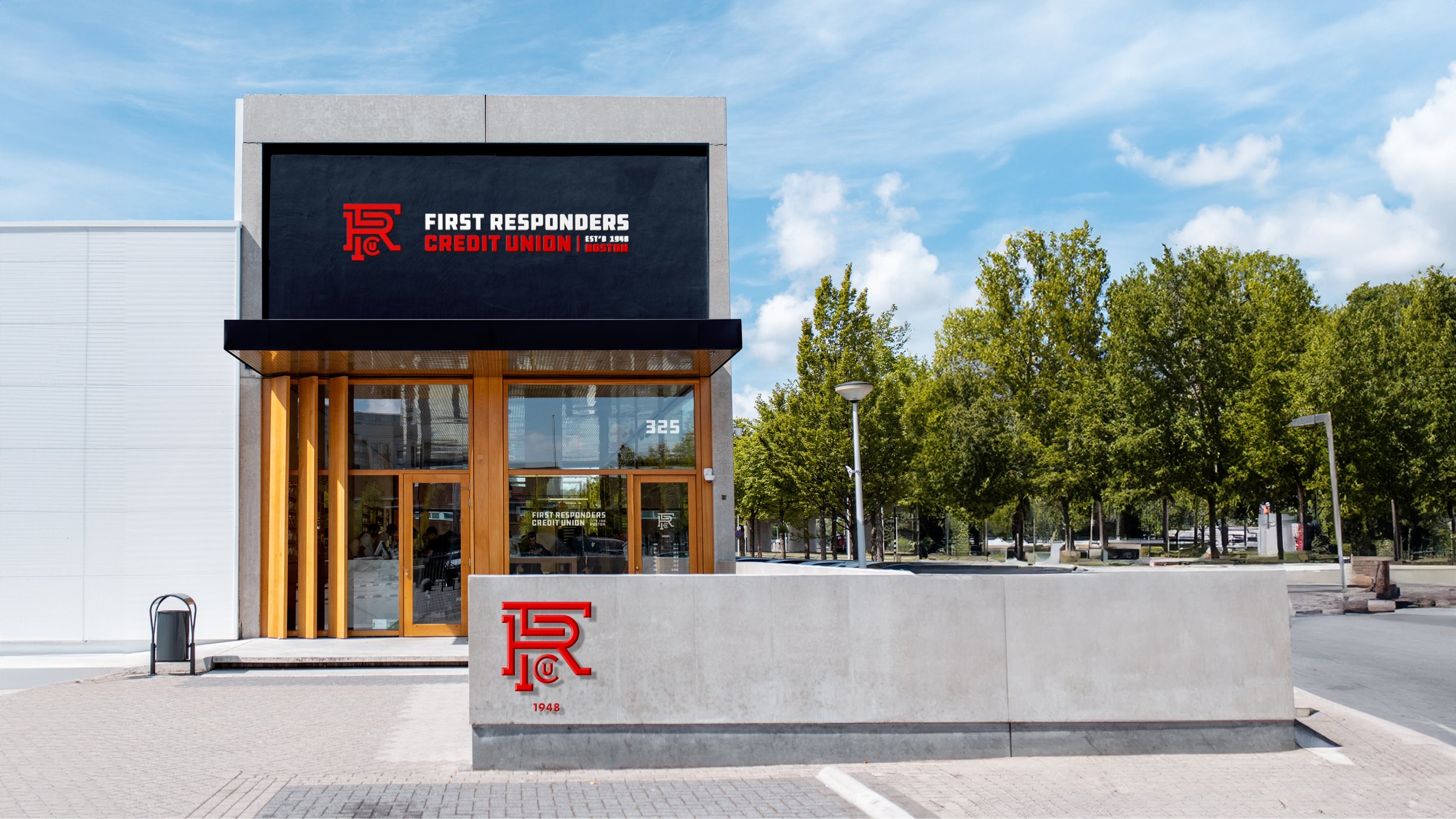
First Responders Credit Union started as Boston Firefighters Credit Union, a credit union built by and for firefighters. But success had widened the circle. Over time, membership grew to include EMTs, nurses, police officers, and others who spend their lives taking care of the rest of us.
So the first job was the name. First Responders Credit Union allowed the organization to honor its firefighting roots without making anyone else feel like they were standing outside the station waiting to be invited in.
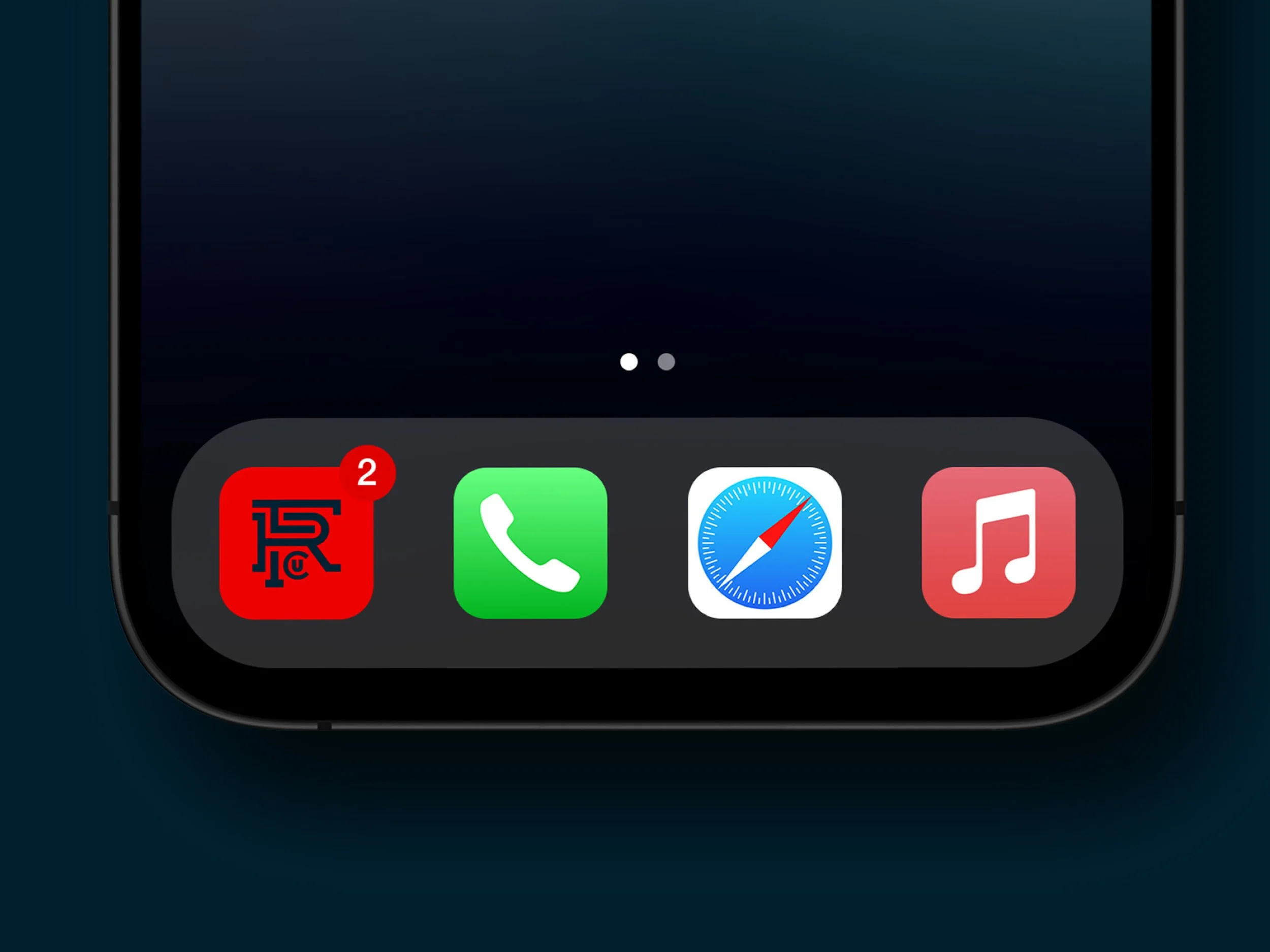
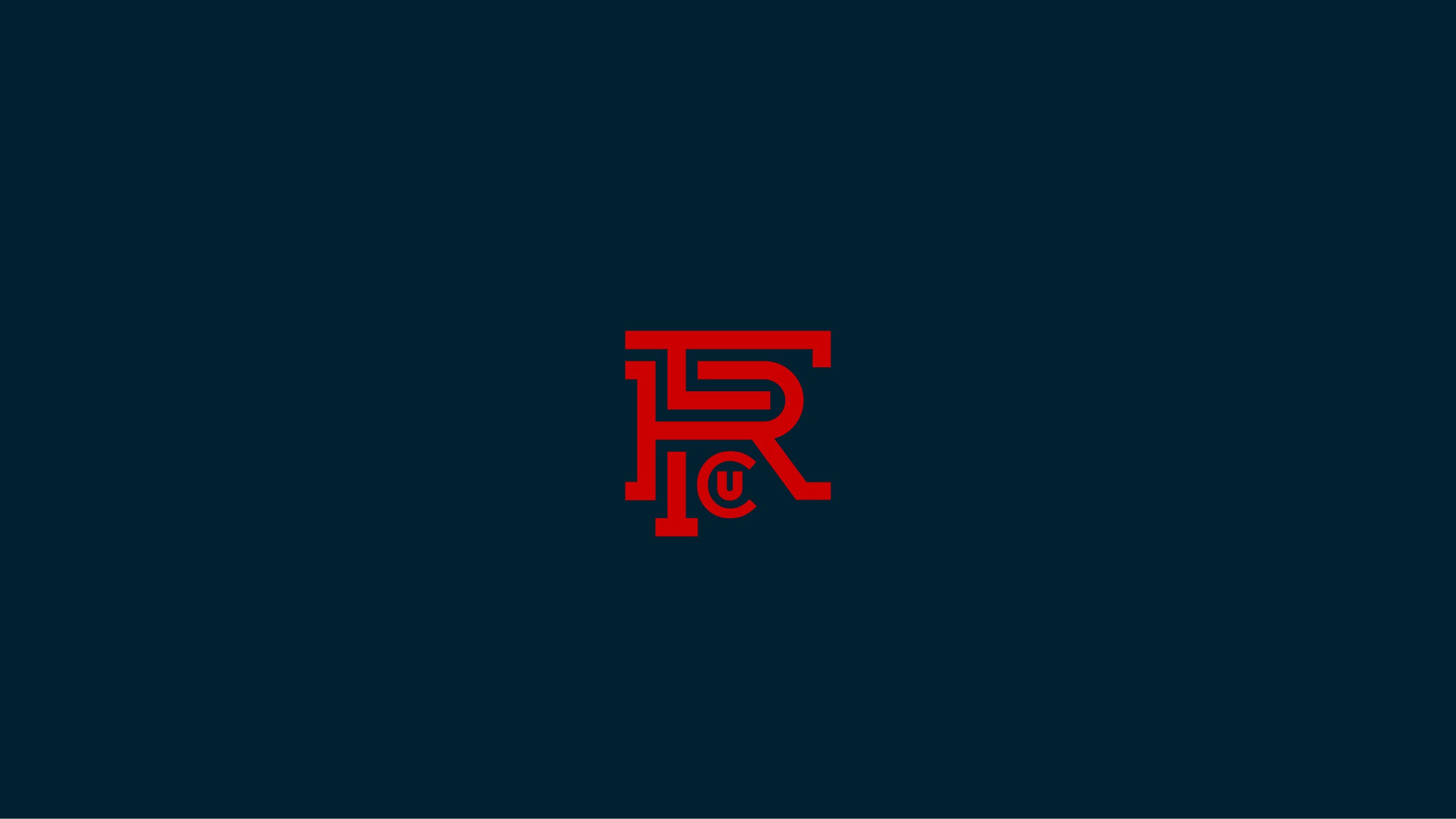
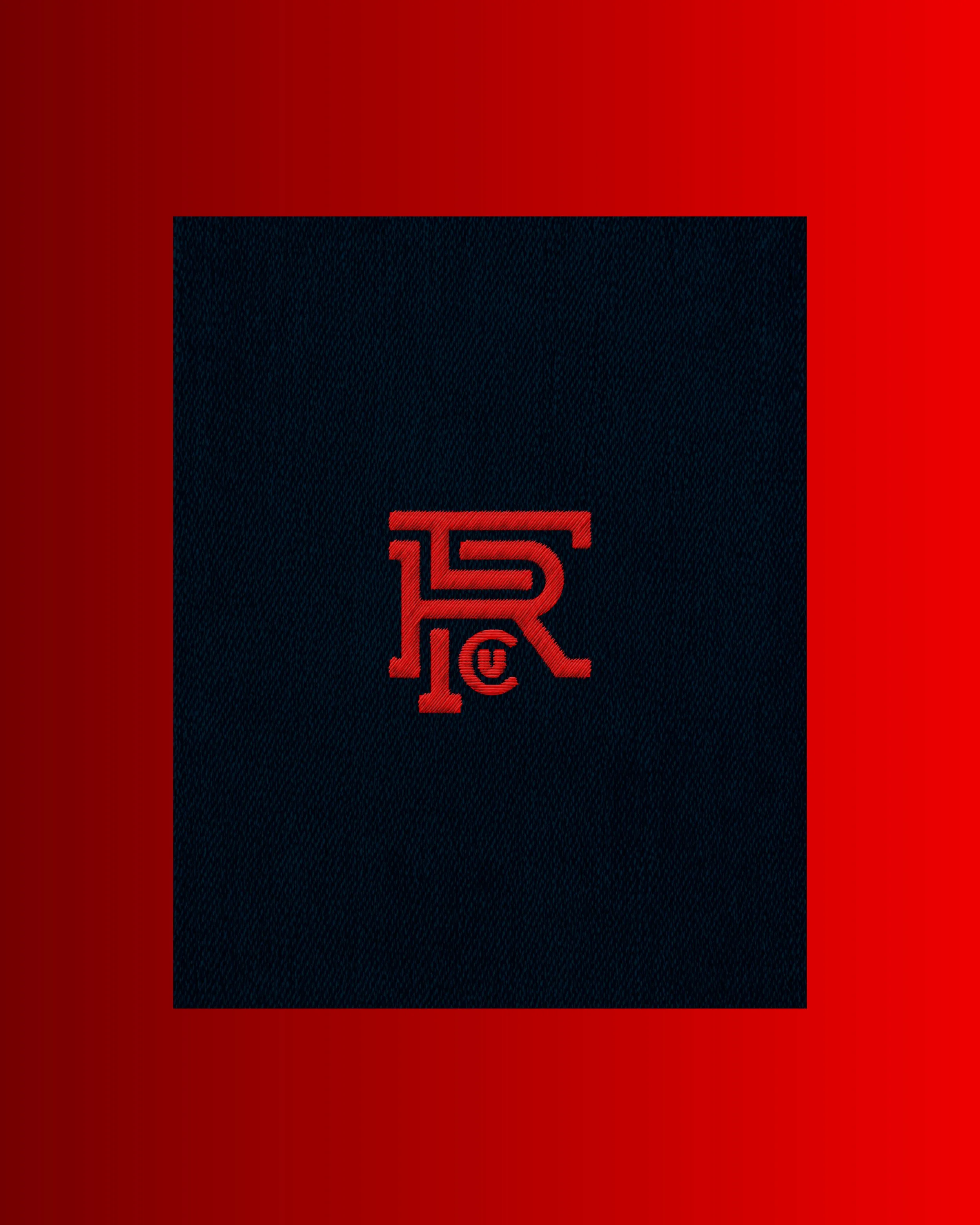
The identity needed to do the same thing. Monograms are woven throughout first responder culture — on uniforms, patches, departments, teams, clubs, and the kinds of things people wear when belonging actually means something. We built a mark that felt rooted in that world without belonging to only one part of it: a symbol for the staff, the members, and the broader community the credit union was built to serve.
FRCU
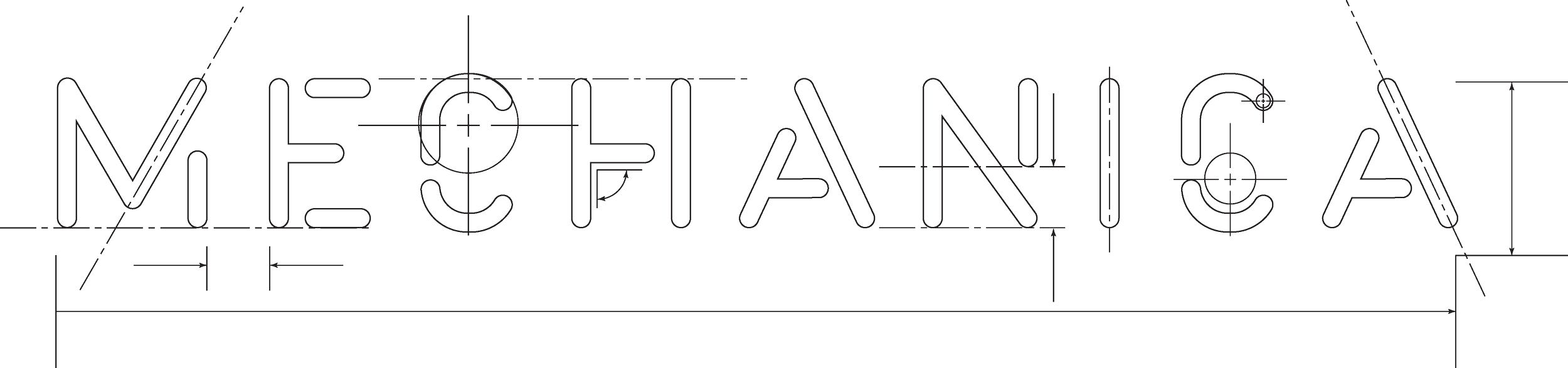
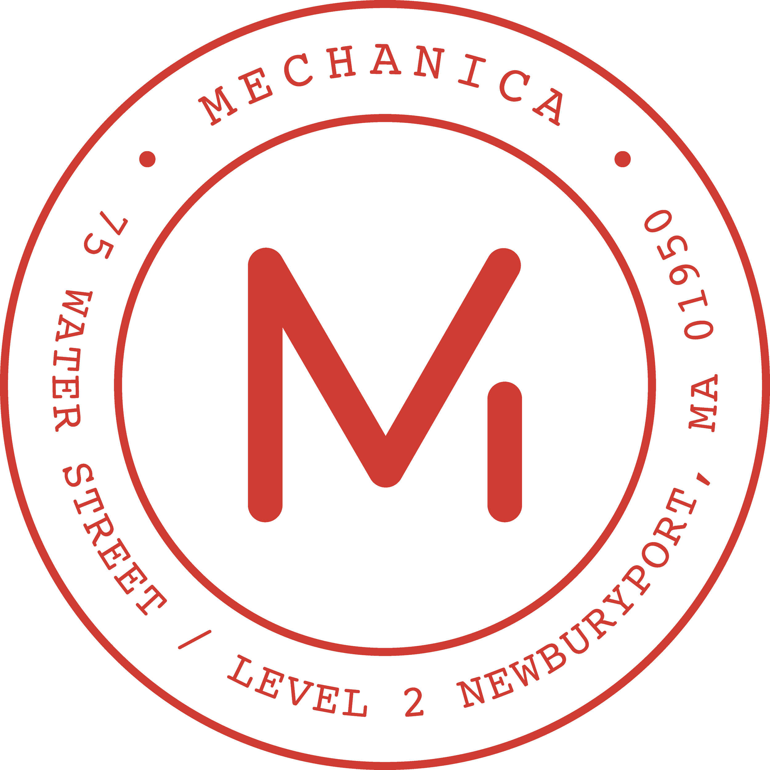
Mechanica, a strategic brand consultancy, was built around a belief that brands do not become durable by accident. They are engineered, pressure-tested, edited, rebuilt, and made stronger through strategic rigor. So the identity needed to feel less like decoration and more like a working tool.
The logo and wordmark were inspired by the visual language of mechanical engineers, draftsmen, and old-school lettering stencils — the kind made for clarity, consistency, and not making the next person in the process hate you. The mark itself was pulled directly from the wordmark, giving the system a sense of precision without becoming precious.
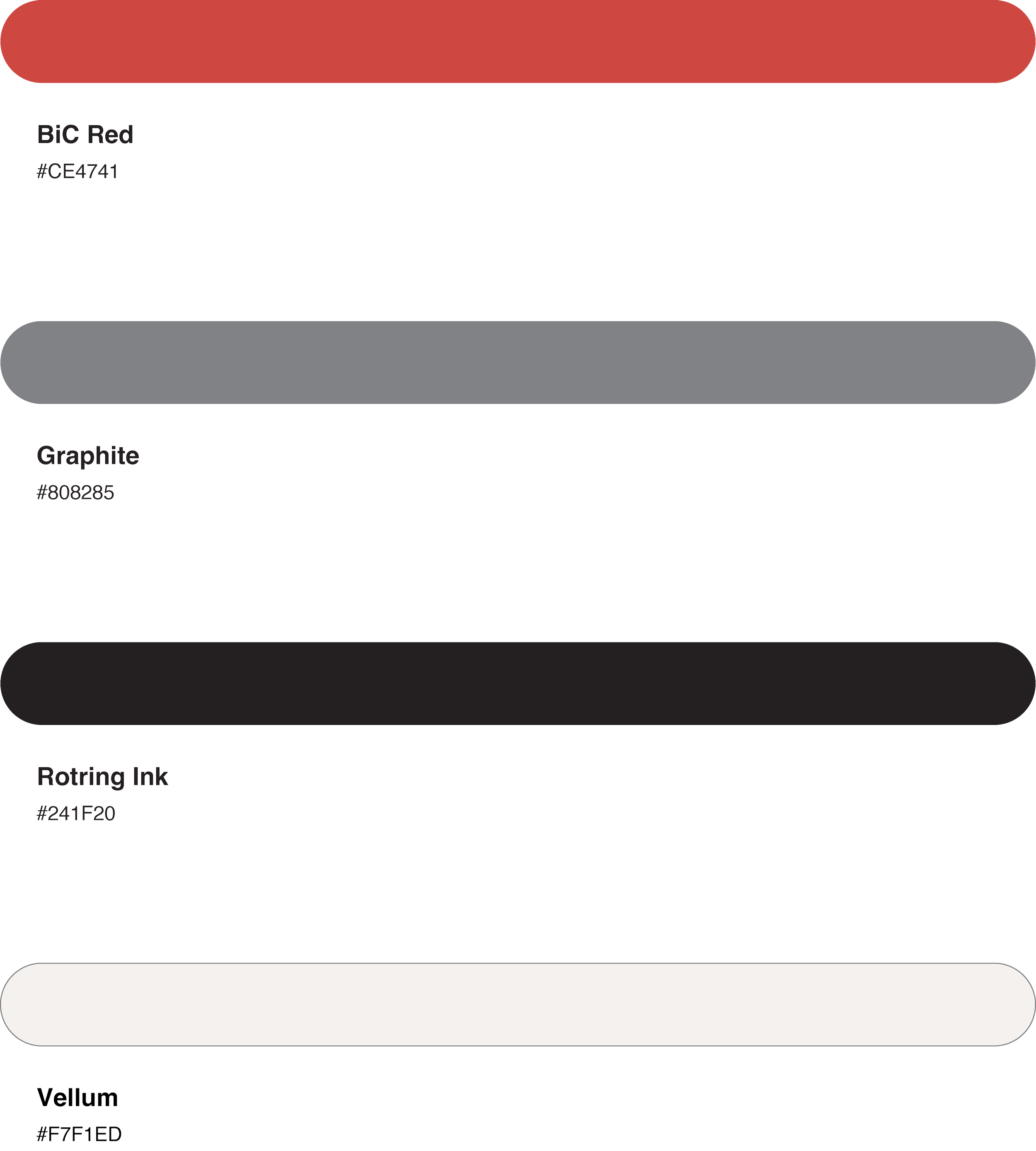
Because Mechanica’s work lives in service of its clients’ brands, the identity also had to know when to get out of the way. The palette — Vellum, Graphite, Rotring Ink and Red BiC Pen — was built from the materials of thinking, drawing, drafting, and editing. Paper. Pencil. Ink. Correction. The basic tools of a well-planned idea.
Mechanica


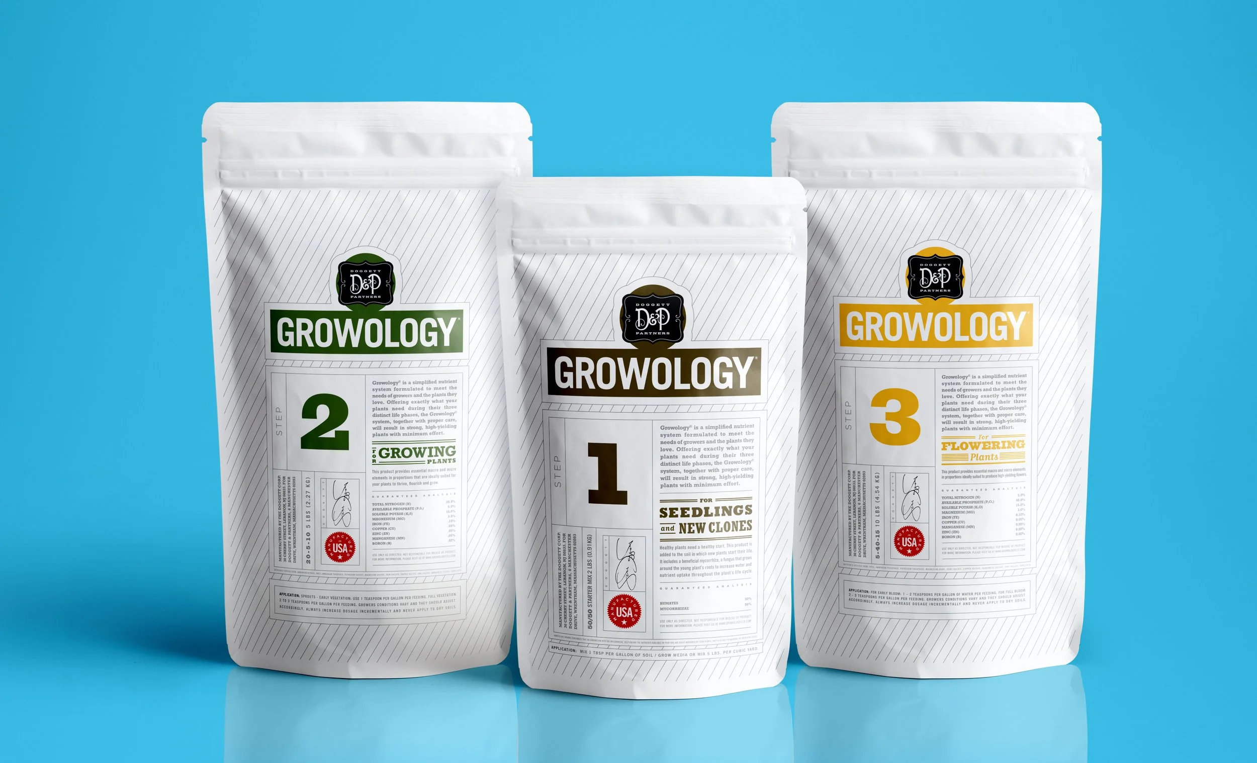
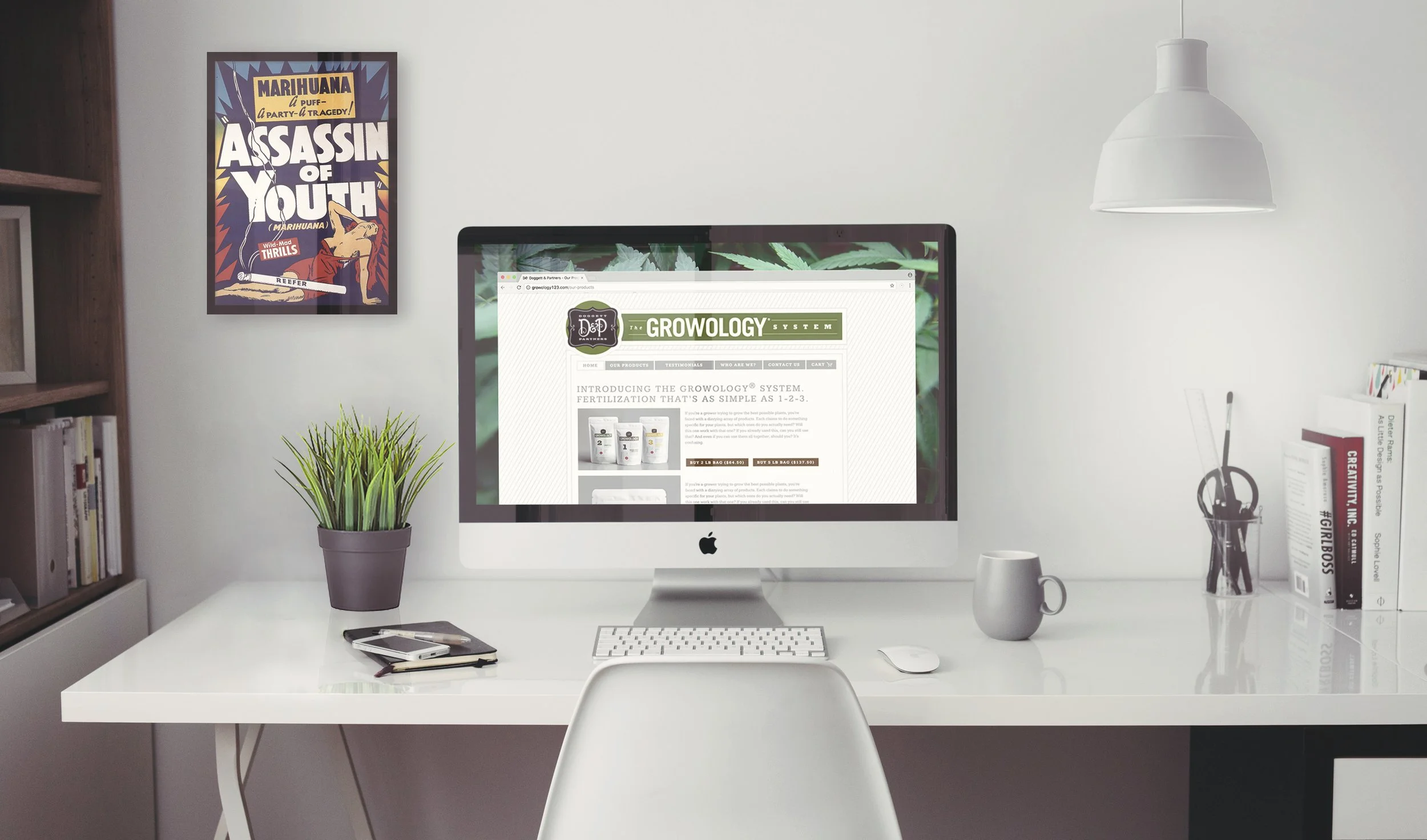
Growology was a fertilizer system for growing medical-grade cannabis, which meant it lived in a category with no shortage of tie-dye, psychedelic typography, and brands that looked like they were still following the Grateful Dead around in a van. RIP, Jerry.
Growology wanted to stand apart, but like most startup brands, it also needed the few opportunities it had to make a real impact. Their approach to plant growth was more systematic, more scientific, and a lot more intentional than the category usually looked. But we did not want the brand to feel cold, clinical, or like it belonged on a shelf next to industrial lawn chemicals.
The identity had to strike a balance: smart enough to signal science, structured enough to support a full product system, and handmade enough to keep the brand approachable. Less head shop. Less lab coat. More thoughtful growing system for people who took a more scientific approach to the Devil’s herb.
Growology

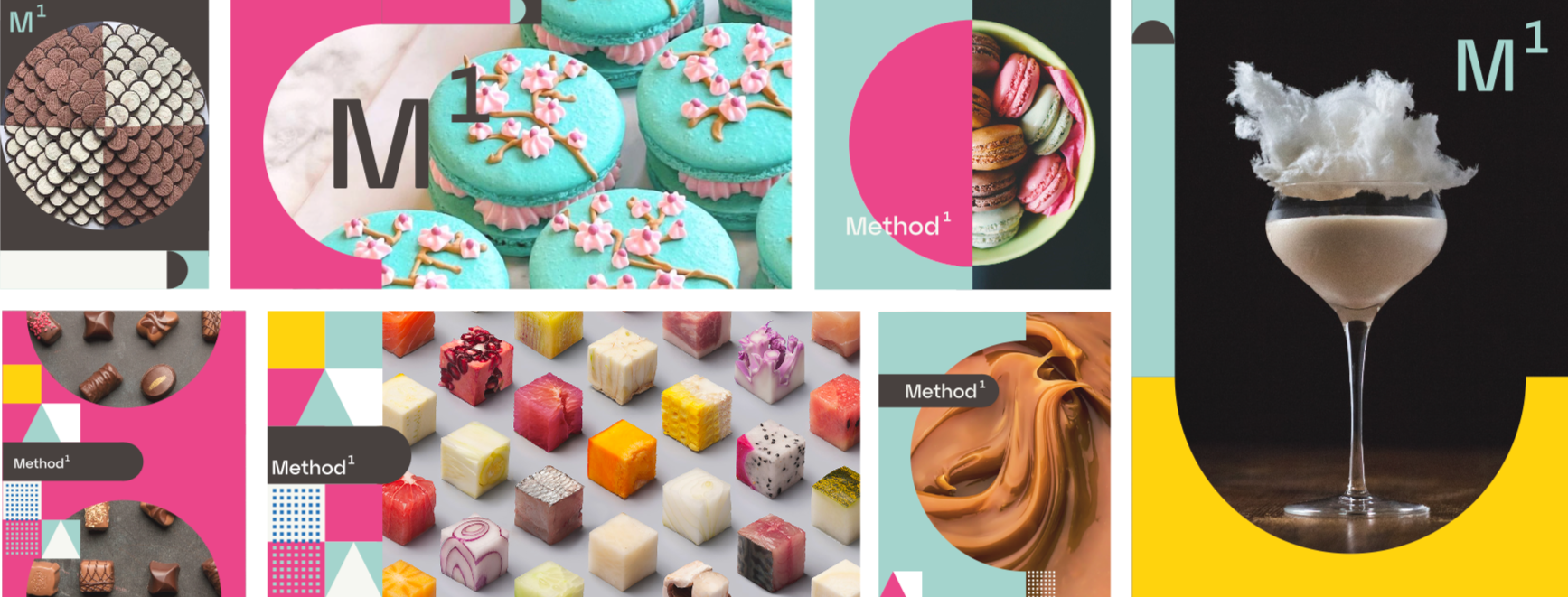
Xenopsi became Method1, a name that better reflects the consultancy’s disciplined approach to building luxury and indulgence brands. These are emotional categories — desire, taste, ritual, status, pleasure — but Method1 brings behavioral science to the table, using a deeper understanding of human decision-making to help brands become more meaningful, memorable, and effective.
The identity needed to live in that tension: strategic but not cold, refined but not precious, scientific without looking like it belongs in a pharmaceutical conference booth.
Method 1
Structure
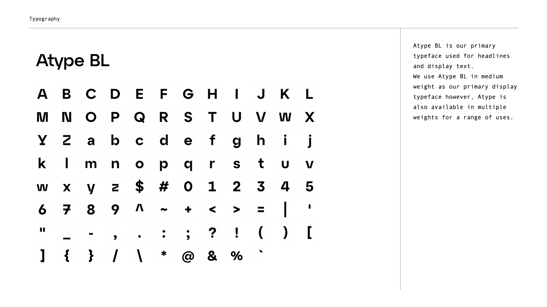
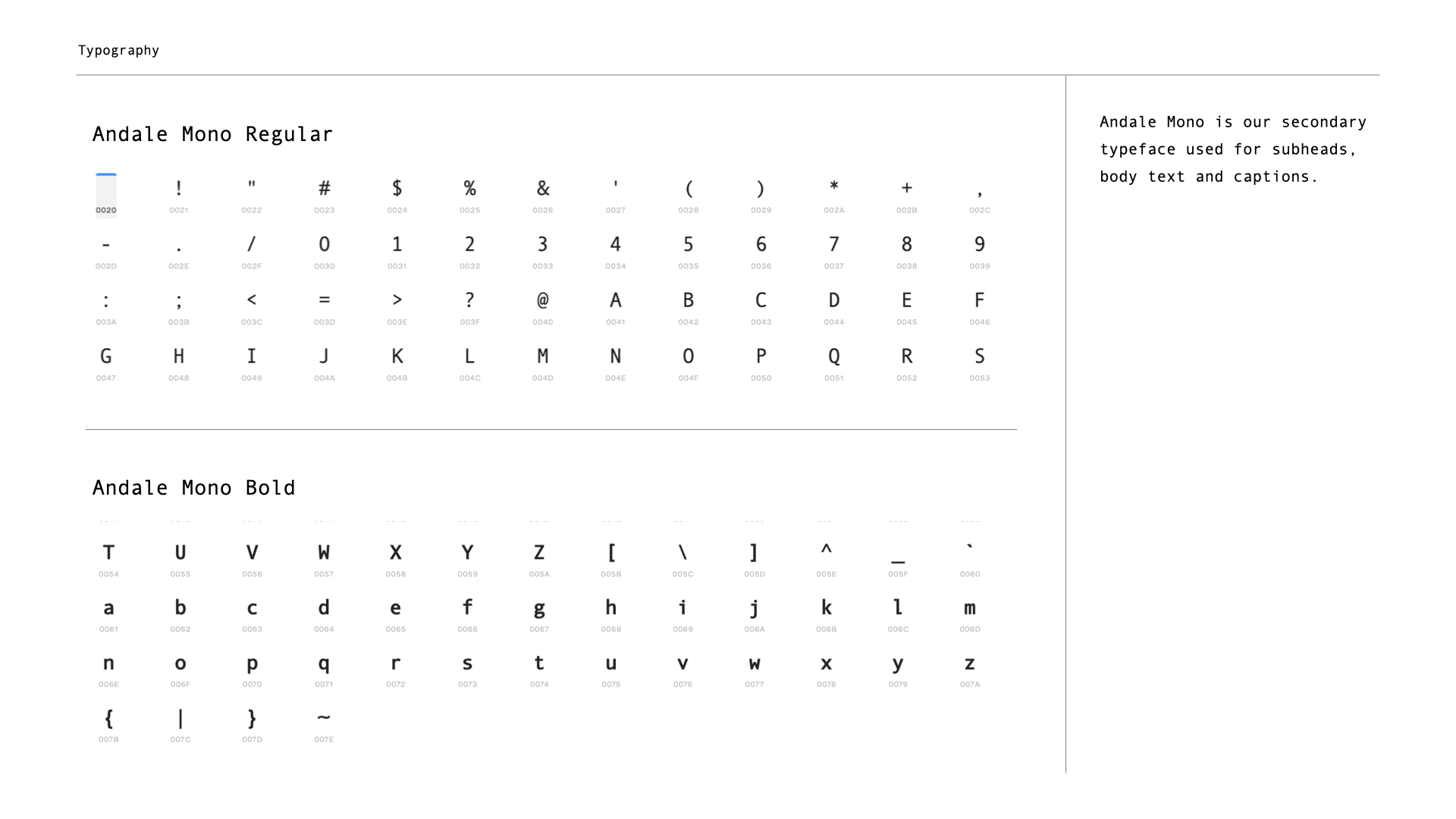
Typography
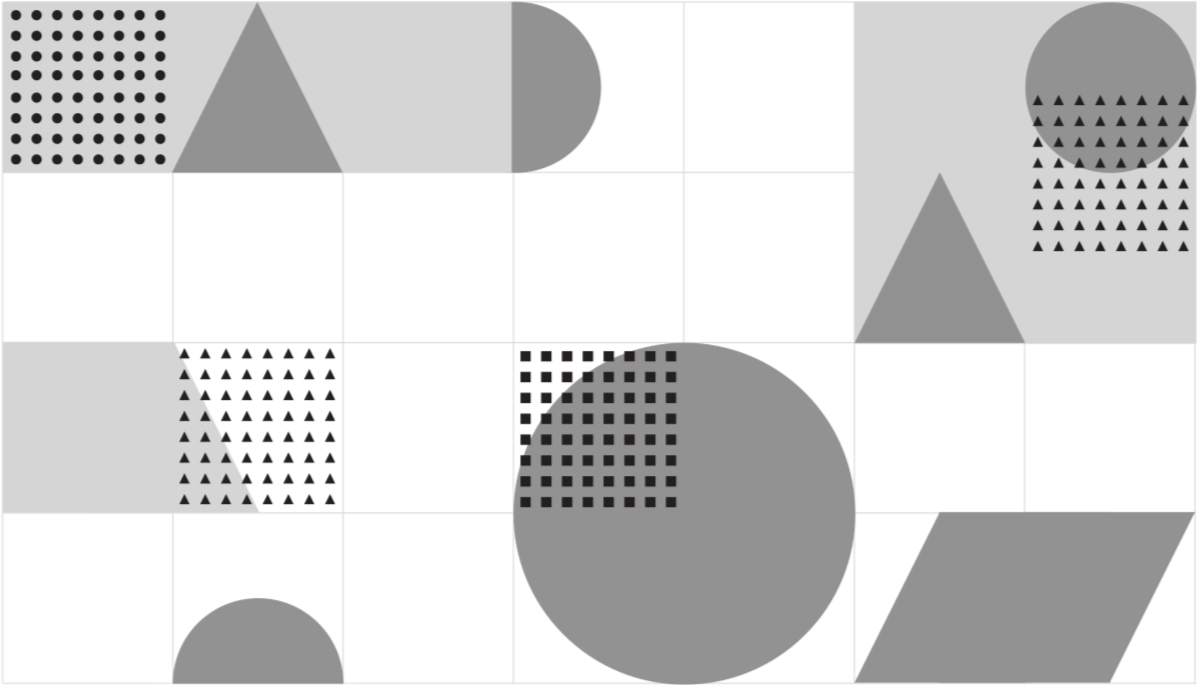
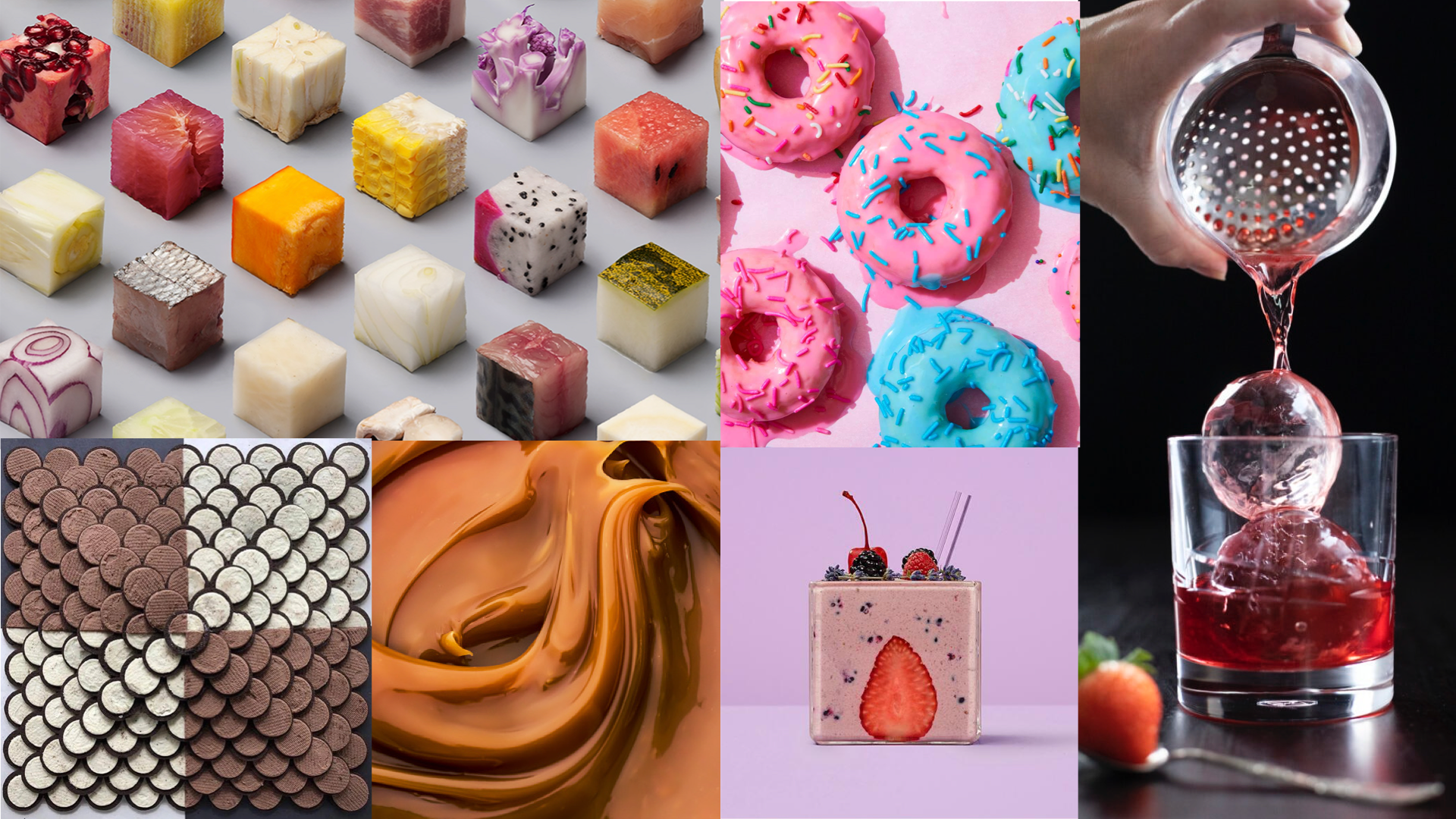
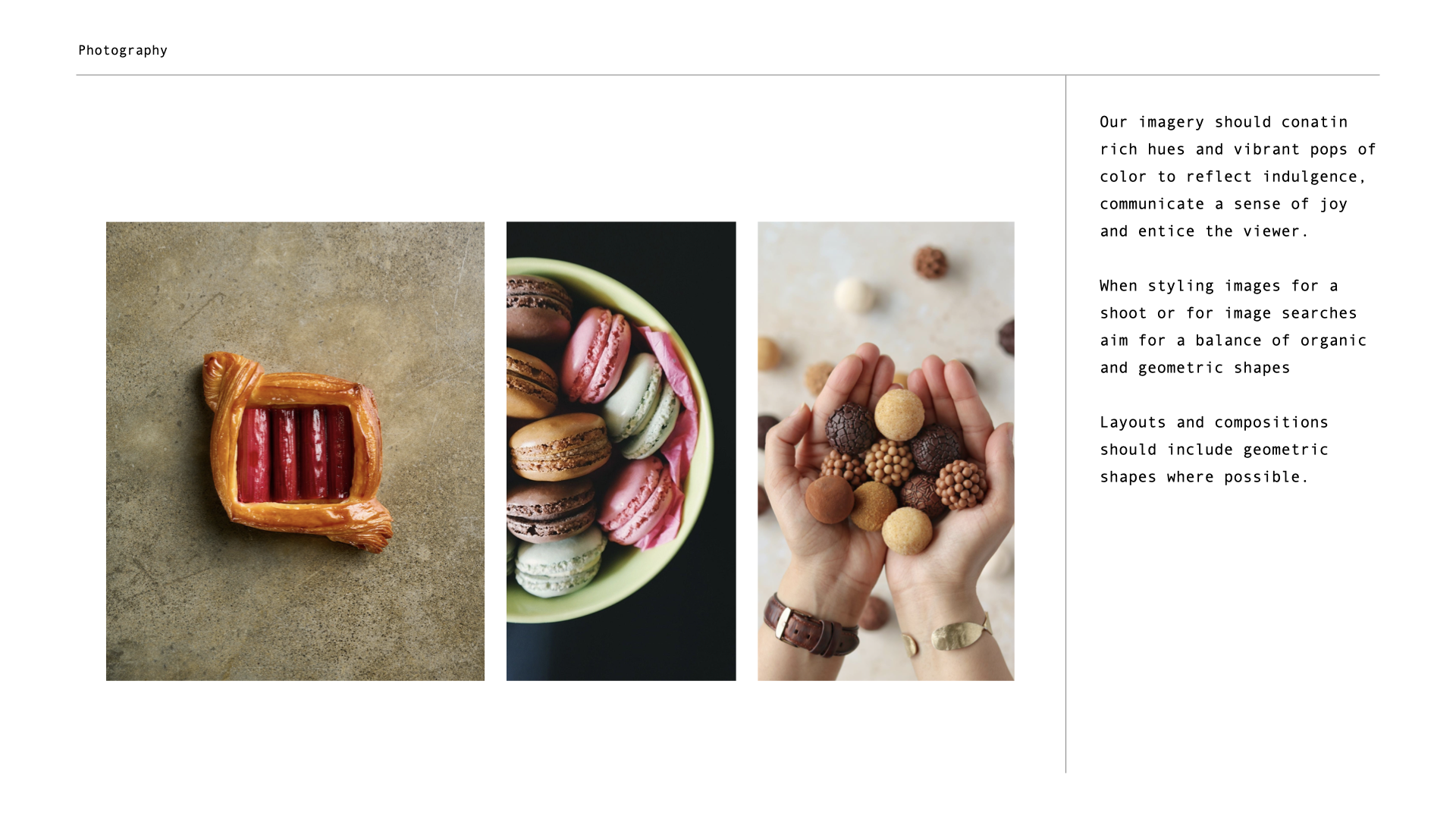
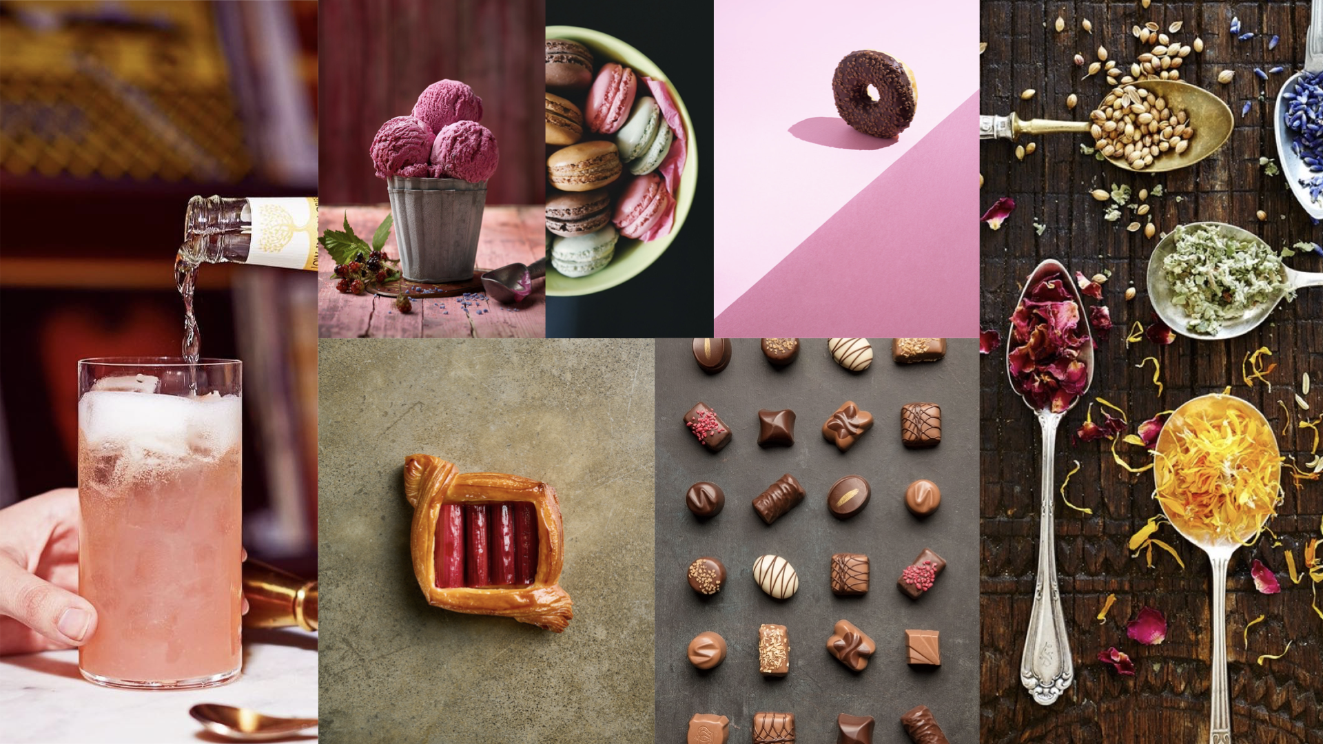
Brand Imagery
Putting it all together