I had the great honor of helping reimagine the brand identity for The VII Foundation — an organization committed to supporting deeply reported journalism and photojournalism that documents some of the most pressing issues of our time. Their work helps communities see the truth clearly so they can make informed, evidence-based decisions about the challenges affecting their lives.
The foundation’s original logo was the simple Roman numeral VII — a reference to the seven founding members. For the identity refresh, the task was to honor that history while giving the mark a purpose beyond itself. The goal was to create something that could serve as a visual device, not just a static symbol.
As a nonprofit, a key consideration was building an identity that could be simple, scalable, and repeatable across platforms, keeping production costs low and execution efficient. But that simplicity could not come at the expense of presence. The system still had to carry weight, feel considered, and hold its own alongside the important stories and imagery the foundation supports.
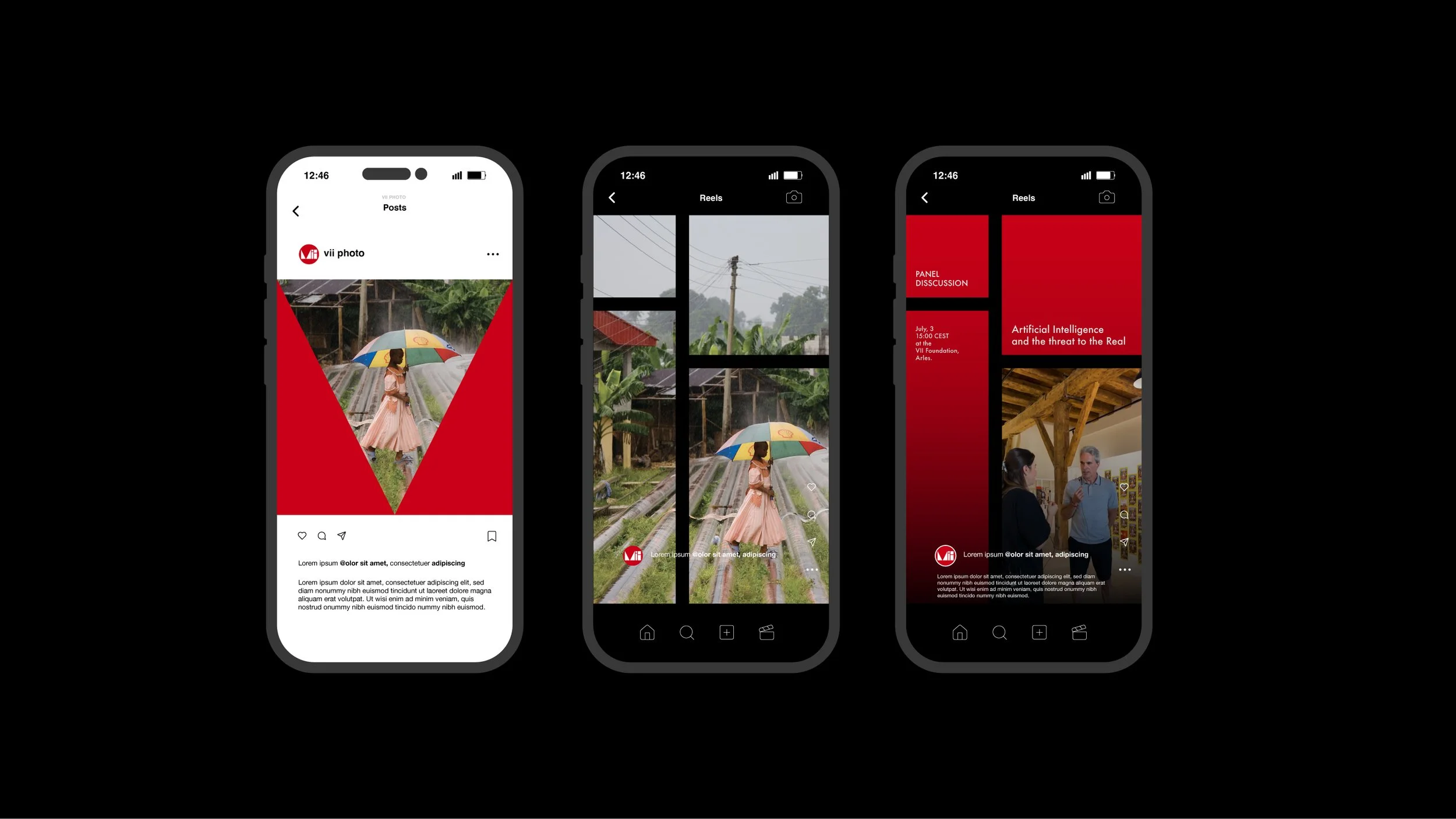
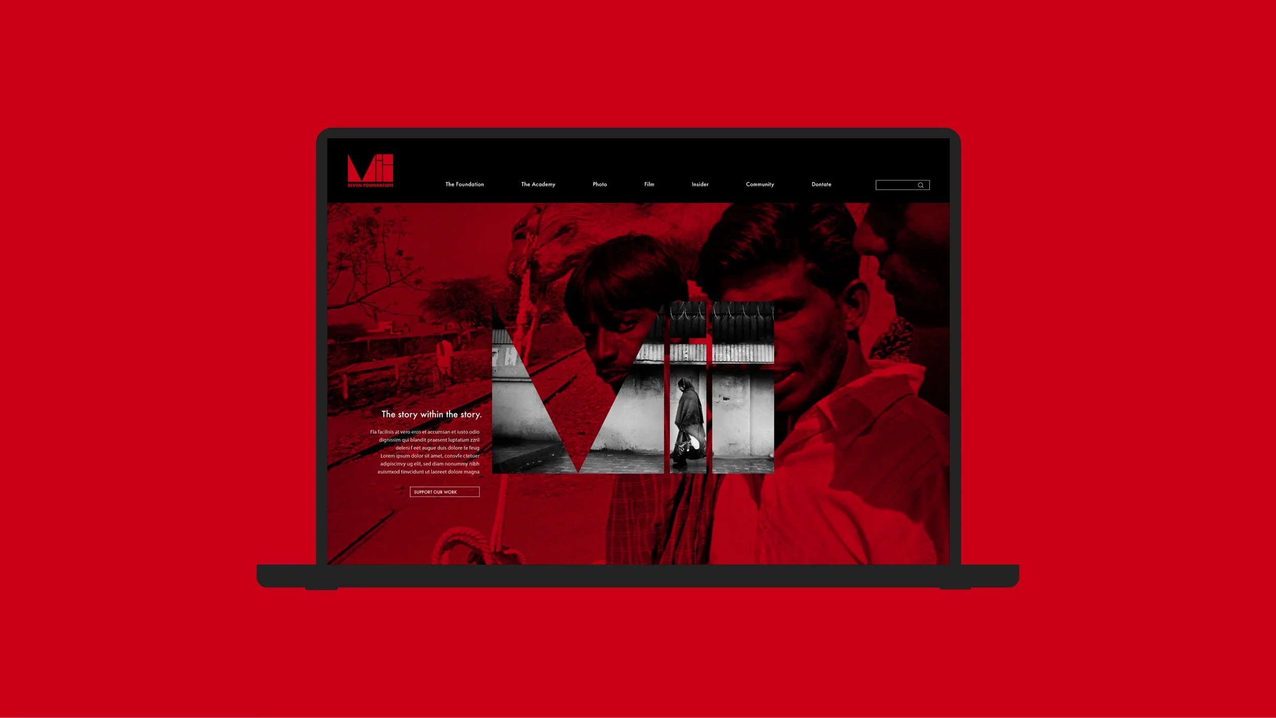
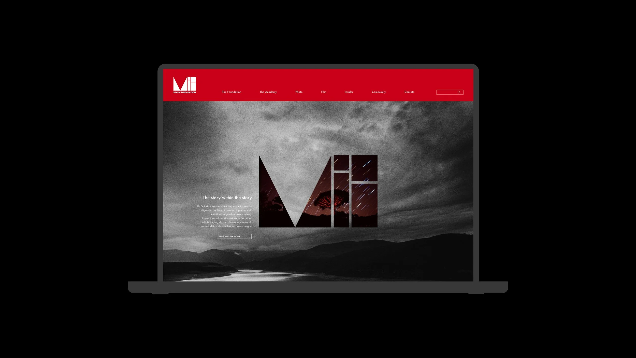
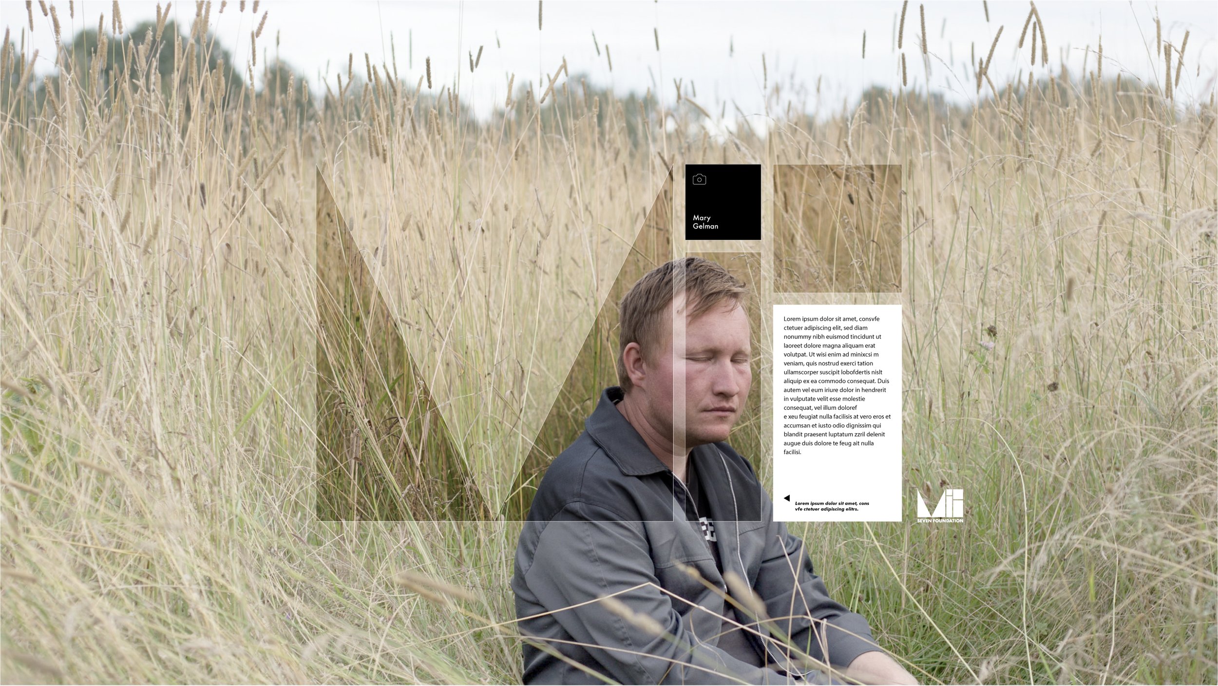
The result is a dynamic yet efficient identity system — one that sits comfortably beside serious storytelling while remaining practical, flexible, and visually distinct.
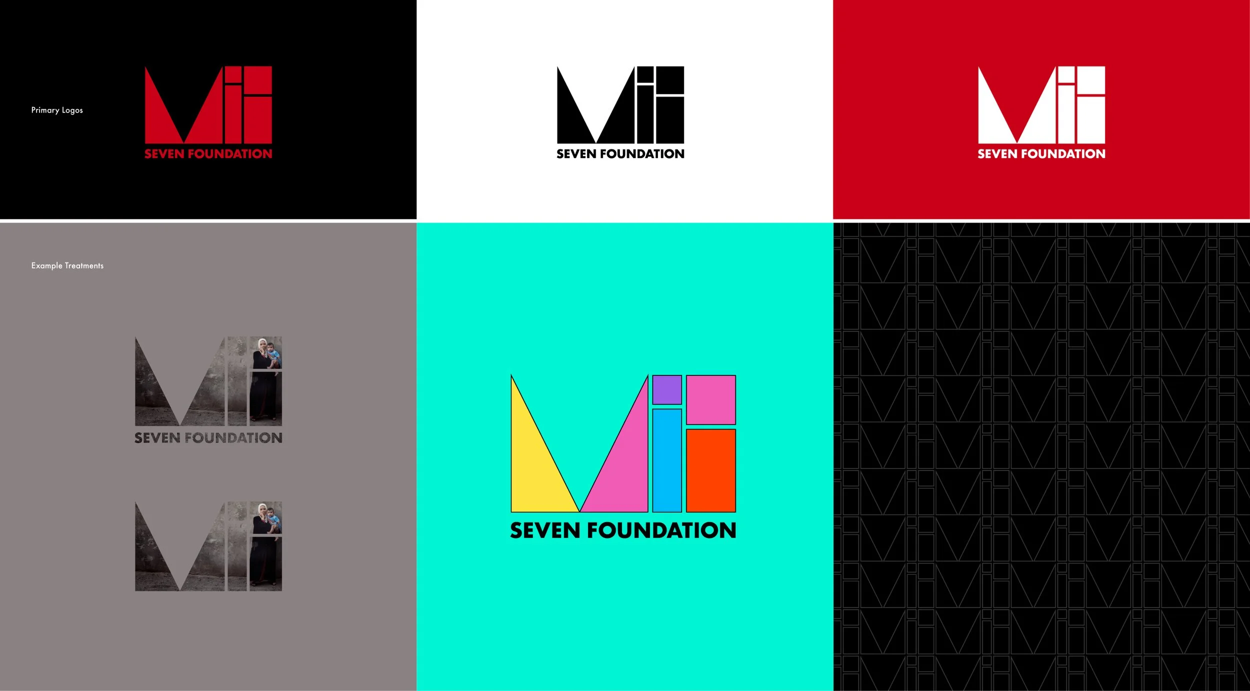
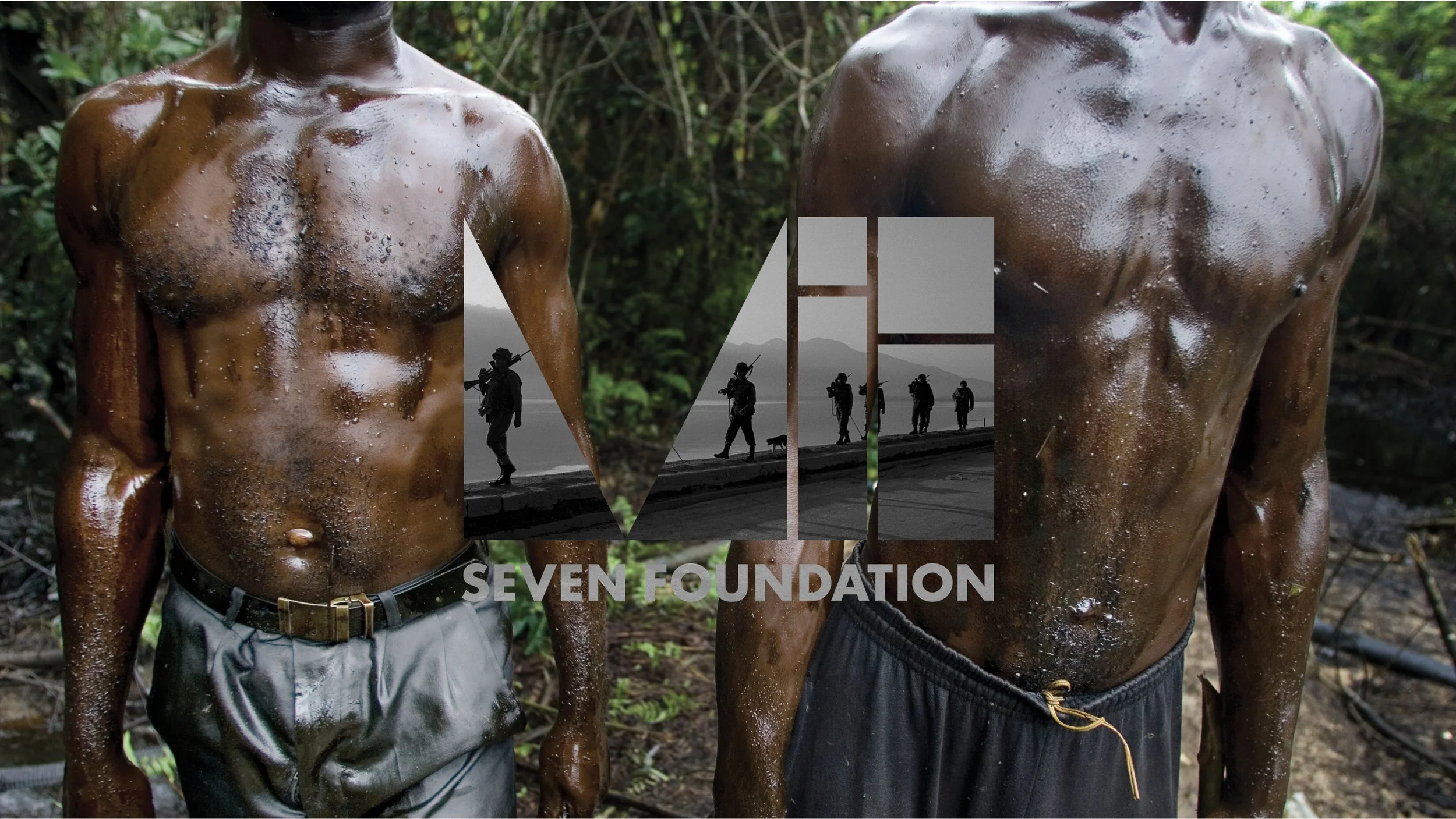
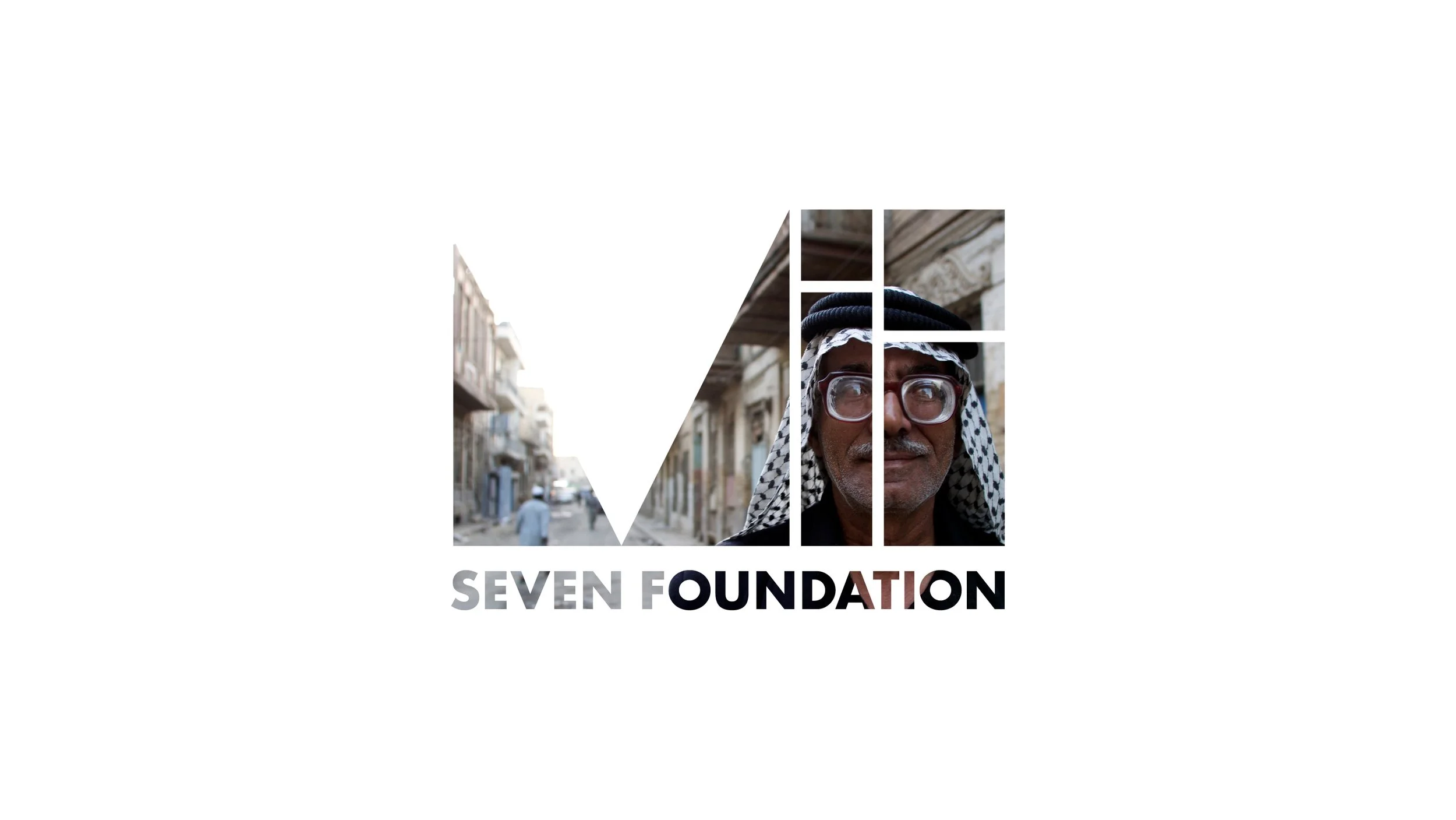
Primary Logo
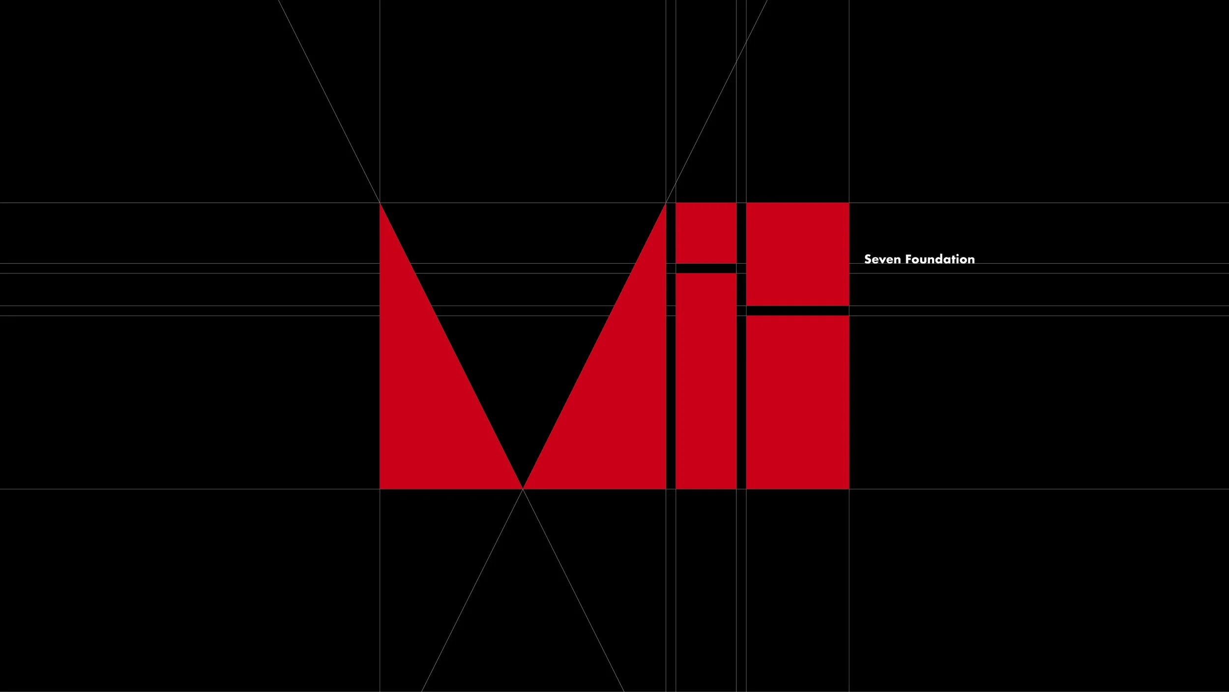
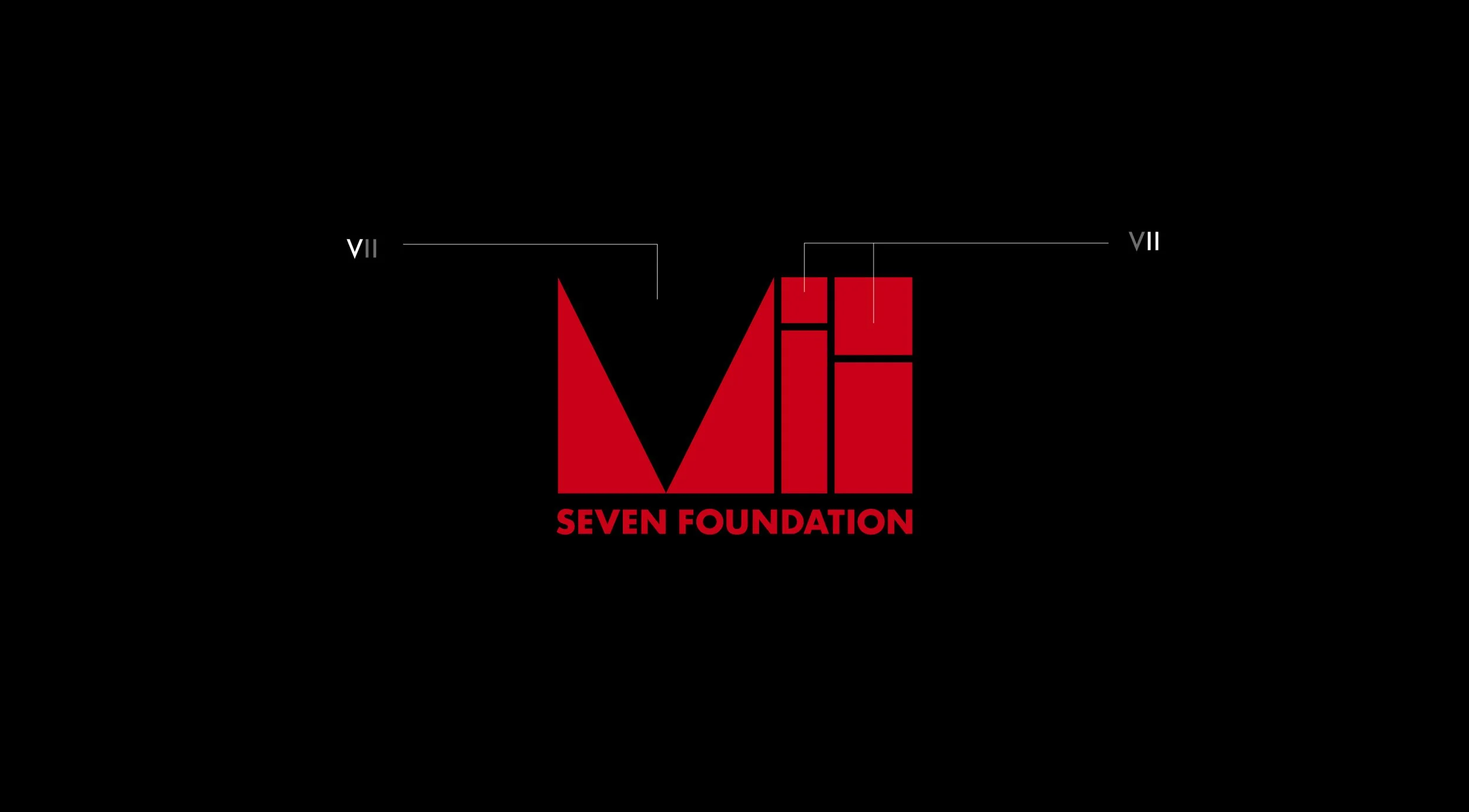
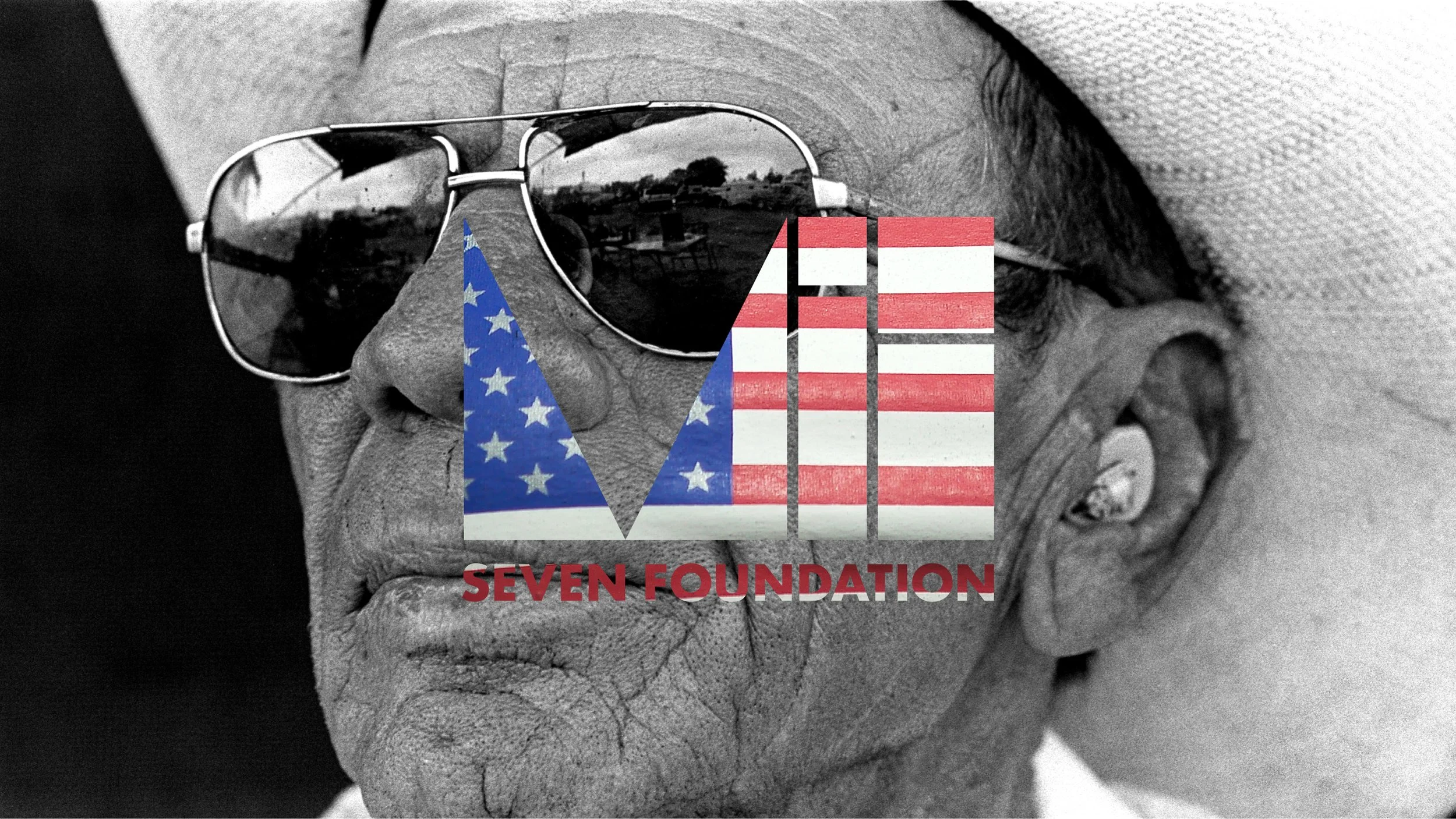
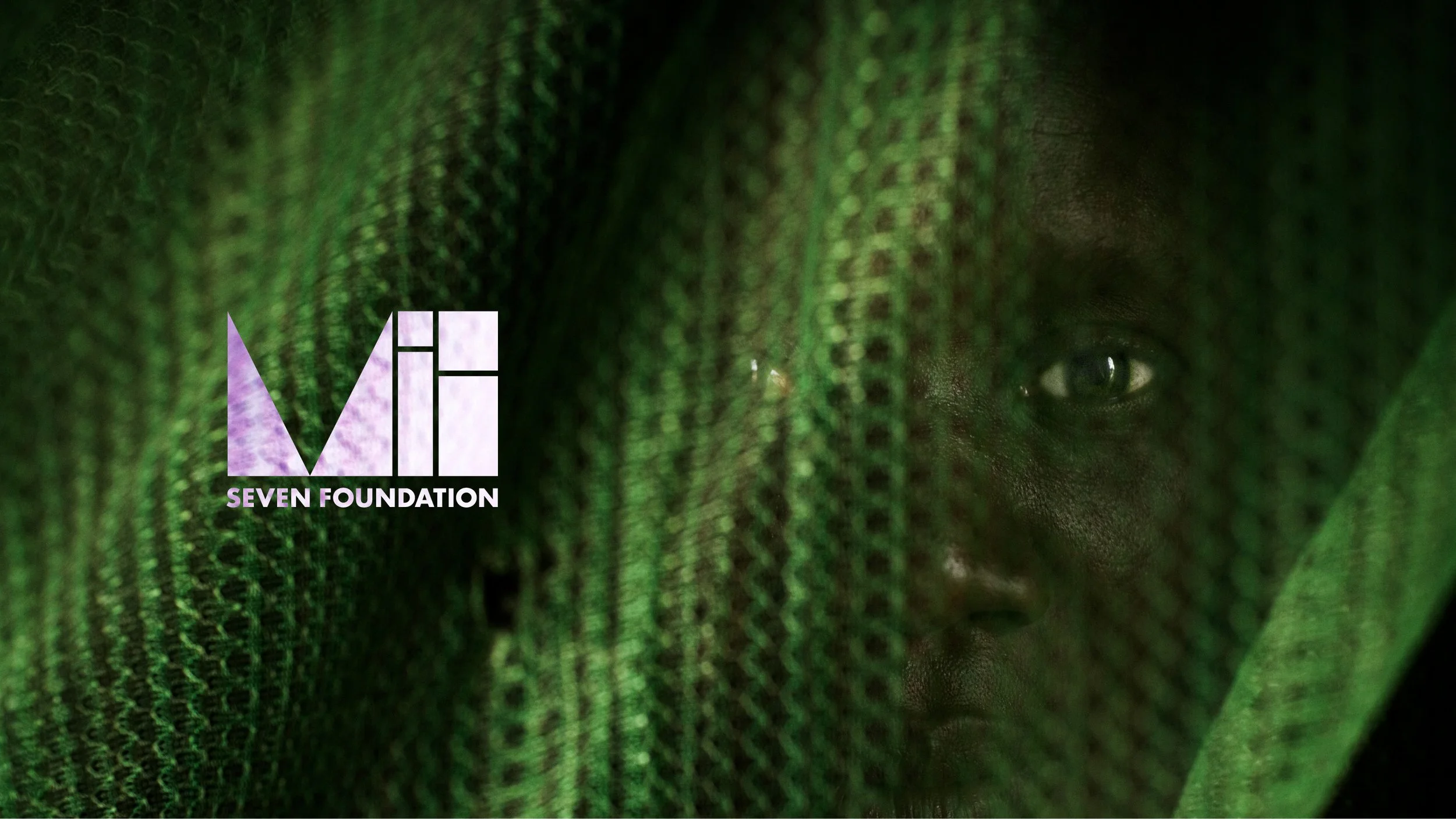
The VII Foundation logo is a contemporary reimagining of the original, blending historical influence with modern design. The V shape represents an aperture, highlighting the way stories are framed and viewed — whether closely examined or broadly contextualized. The logo’s structure draws from the golden section, a historic visual device celebrated for its sense of balance and harmony.
This connection to the golden section not only underscores the significance of a focal point — guiding the viewer’s eye to the heart of each story — but also reveals an abstraction of the two “I”s in the foundation’s name.
The design is both a tribute to timeless storytelling techniques and a modern expression of the VII Foundation’s mission to frame impactful narratives with precision and clarity.
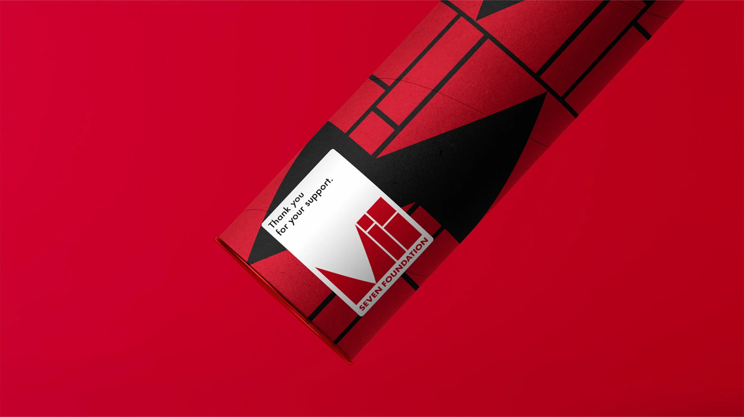
Color
The primary color palette for the brand is centered around Red, Black, and White. Red, a brand color since the beginning of the brand, conveys energy, passion, and a sense of urgency—qualities that align with the brand’s commitment to impactful storytelling. Black and White complete the palette, offering a timeless quality and reflecting a commitment revealing the truth.